
 Article
6 Ways to Improve Contrast in Your Designs
Contrast is a difference, especially a strong dissimilarity, between entities or objects compared. In simple terms, it’s when two elements on a page are distinctly different. Designers use contrast for various reasons. You can use it to:
- Emphasize the focal point.
- Improve readability.
- Establish hierarchy.
- Add visual interest.
Adding contrast to your designs can give it some extra pop. In this article, we’ll share some of the ways you can use different types of elements to improve contrast in your designs.
Let’s begin.
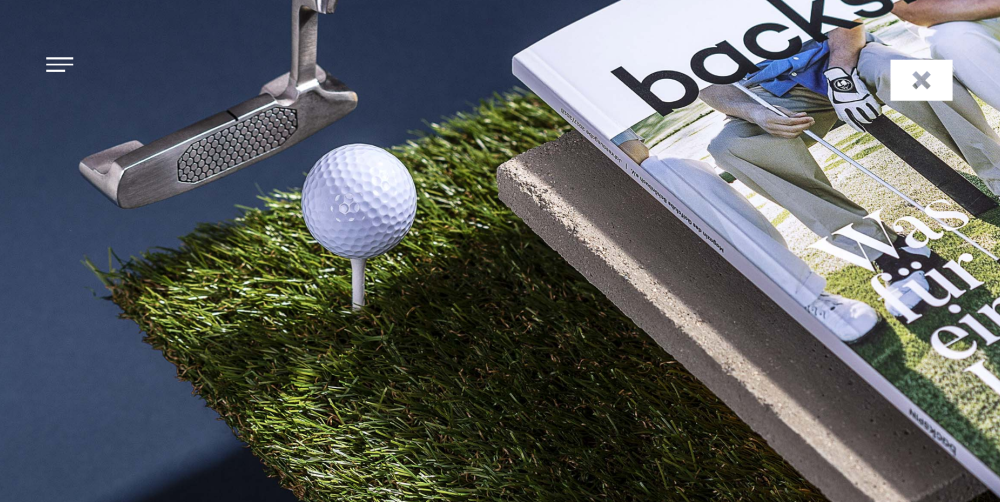
#1: Resize elements
Creating a clear focal point in your designs can be pretty difficult if you’re trying to make things as similar or symmetrical as possible. Elements with the same size, color and weight will likely end up being inconspicuous.
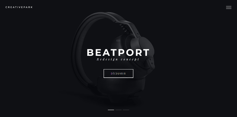
One of the easiest ways to add contrast to your designs is by making one element bigger (or smaller) than the elements around it. The viewer’s eye will naturally be drawn to the contrasting page element because it’ll appear to be different than everything else they’re seeing.
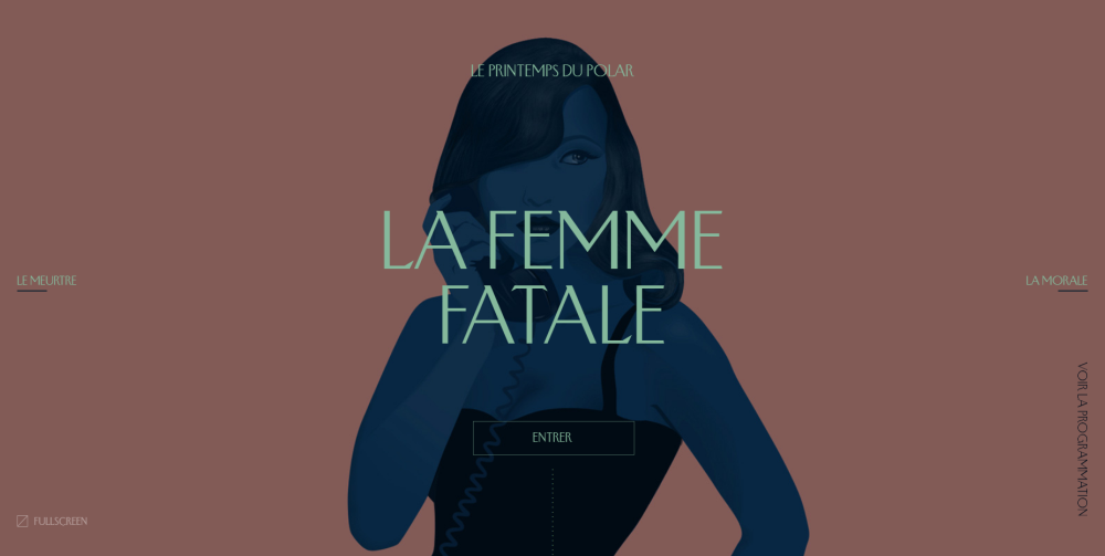
So, for instance, if you were designing a landing page, you’d want to make the call to action button above the fold bigger than the headings and text surrounding it.
Making elements (like images, text blocks, headings, or buttons) bigger goes beyond its dimensions. If you’re working with headings, for example, the font’s weight also affects how big it appears to be. Although the words in this sentence are quite clearly the same size, this part seems to be bigger because it has more visual weight.
Let’s take a look at some examples:
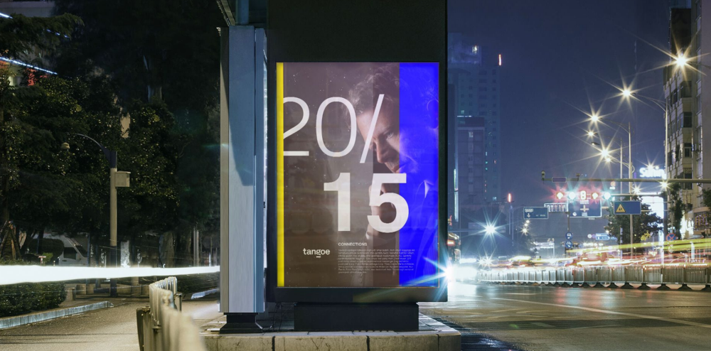
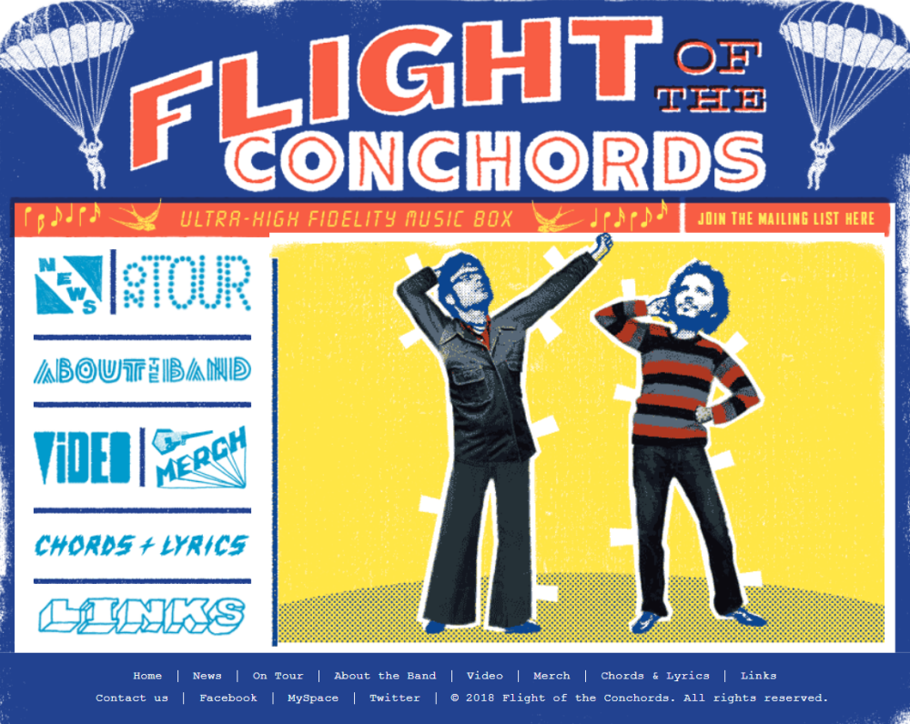
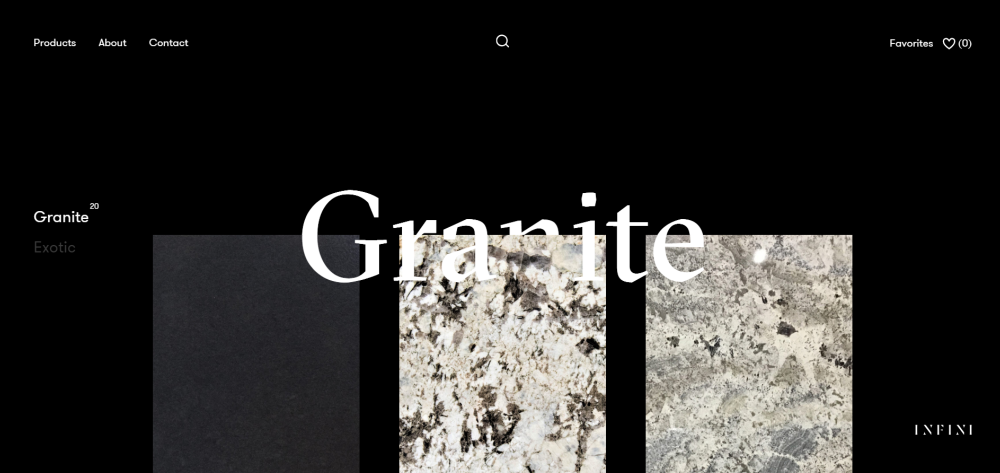
#2: Use textures and patterns
Textures and patterns can help you create high-contrast designs when their characteristics are significantly different from each other. For instance, pairing a rough textured background with smooth foreground text would add contrast to the design.
Textures give designs character. Rough, grainy textures will give your designs vintage qualities whereas subtle noise texture will help create a natural variation similar to one you’d find on printed newspaper. Similarly, photographic textures give realistic-looking results and are another popular way of adding contrast to your designs.
Here’s a look at some examples of websites that use textures and patterns:
The Flight of the Conchords website illustrates how you can use textures in typography to improve contrast.
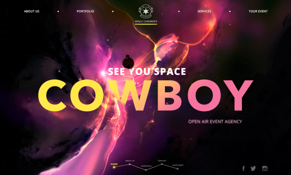
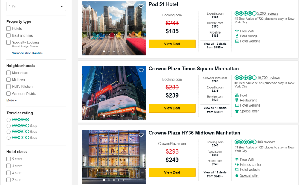
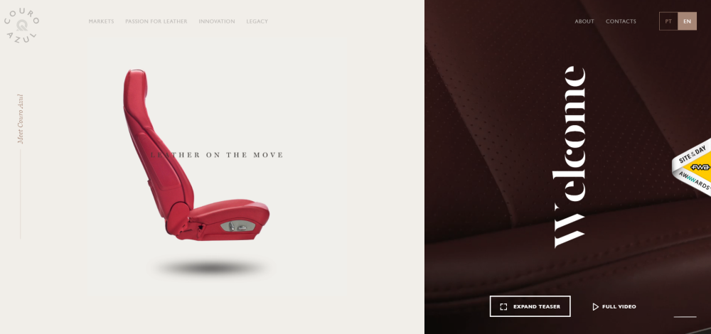
#3: Add color
Adding contrast to your designs using colors is incredibly effective. The best part is that there are several different ways to go about it. You can contrast with dark and light colors, color hue, and/or color temperature.
Contrasting with dark and light colors is pretty simple. Think of light text on a dark background or dark text on a light background. Alternatively, you can put together various color palettes to play with color hues. Specifically, there are three main options:
- Complementary. These are the colors that show up opposite to one another on the color wheel. Some examples include red-green, purple-yellow and blue-orange.
- Split-complementary. This is a variation of the complementary color scheme. It uses a base color and the two colors that are adjacent to its complementary color on the color wheel.
- Triadic. These color palettes consist of colors that are evenly spaced across the color wheel such as purple-green-orange.
The TripAdvisor website uses a triadic color palette in their search results to add some contrast:
Finally, you can mix color temperatures – particularly warm and cool colors – to improve contrast in your designs. Colors like red, orange and yellow are warm whereas blues, greens, and purples are cool colors.
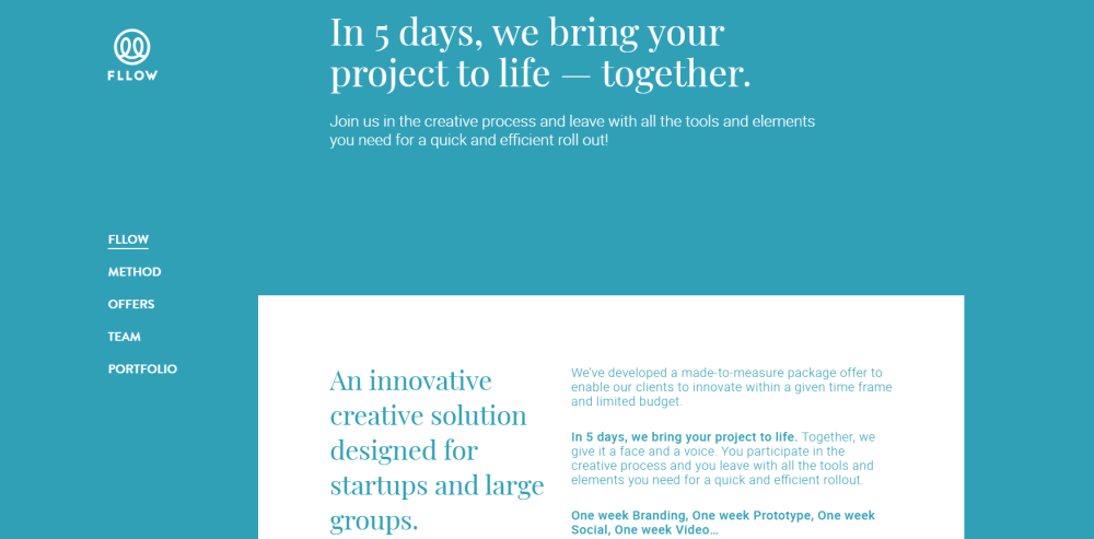
#4: Pay attention to alignment and spacing
White space and text alignment help establish the organizational structure and create visual hierarchy in designs. For example, if you’re designing a page with lots of content on it, surrounding important elements with white space helps them stand out and draws in the viewer’s attention.
Notice how the Information Highwayman website uses white space and text alignment to group page elements together and create a visual hierarchy that guides the reader’s eye down the screen.
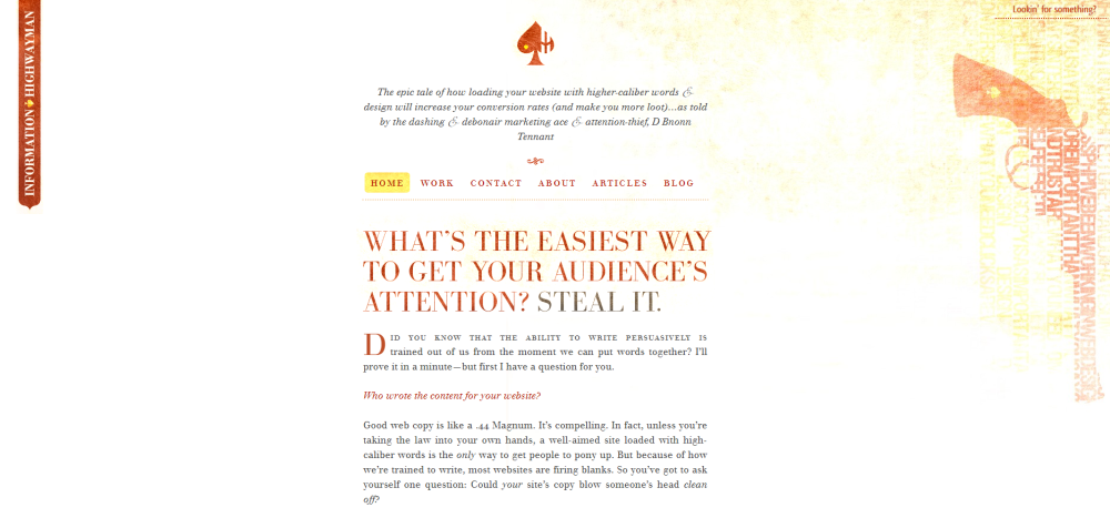
Grouping objects together lets the viewer know that they’re related and separating them divides them into distinct sections. This way, you can achieve contrast in your designs simply by your use of white space and alignment.

Surrounding products with a generous amount of white space infuses your web page with a sense of luxury and elegance.

#5: Make use of typography
Typography is essential to web design and gives you many opportunities to improve contrast in your designs. Specifically, you’re able to add contrast with font combinations, style and weight.
When you use more than one font in your designs to achieve contrast, you’ll need to make sure the font pairings go well together and are visually distinct from one another. One of the most popular formulas is to go with a serif and sans serif pairing. Use a tool like Fontjoy or Type Connection to come up with a good, contrasting font pairing for your designs.
Another easy way to improve contrast through typography is by using different font styles (italic, condensed or small caps) or font weights (light, normal or bold). For instance, you can use a bold font for headings and a light version of the same font for text blocks.
Here are some examples:
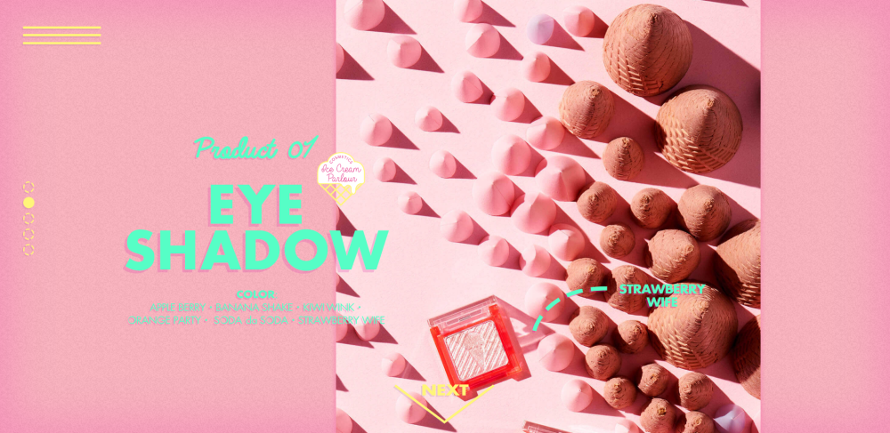
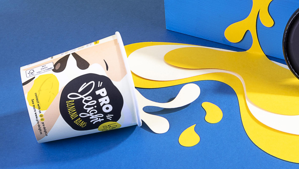
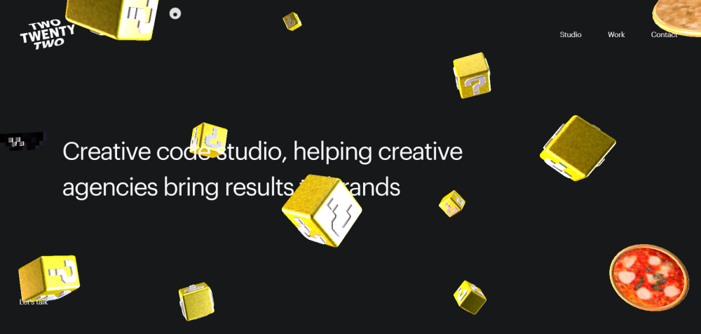
#6: Add unexpected elements
Unexpected elements, when used correctly, can give your designs a balanced contrast. It’s anything that the viewer isn’t expecting to see – something that’ll surprise them.
Though this contrasting technique can be pretty difficult to get just right, there are several different ways you can begin experimenting with it. For example, you might break out of a clean, symmetrical design by introducing an element of asymmetry. Or you could work in a bright color in an otherwise neutral design to make it pop.
Here are some neat examples of using unexpected elements to add contrast:
Conclusion
Adding contrast to your designs is a great way to emphasize what’s important and direct the visitor’s eye to a particular element on the screen. Designers use size, color, type, and alignment to improve contrast in their designs and make ordinary web pages look interesting.
Let’s recap some of the ways you can add contrast to your designs:
- Use big and small elements in your designs to establish visual hierarchy and let the reader know what’s important.
- Use textures and patterns in backgrounds and typography to make them stand out.
- Add color to make page elements pop.
- Surround important elements with white space and pay attention to alignment.
- Use typography by pairing contrasting font combinations.
- Add unexpected elements to introduce an element of surprise in your designs.
Are there other elements you use to improve contrast in your designs? Share your thoughts in the comments section below!
Down The Rabbit Hole