 Website Development
 Managed Hosting & Maintenance
 Fractional CTO
 Guide
Guide

 Article
5 Components of modern web design
Just any old website design won’t do. Neither will that website that you launched 10 years ago.
Users want, and demand, modern website interfaces. A modern design shows that you care and that maintain and update your website and content regularly. (Even if it isn’t, a modern design will give this impression.)
A modern design will also lend credibility and authority to you as a website owner.
But how does modern website design look? There are a handful of common components that most of these designs include. Here’s a look at each one.
1. Large, readable typography
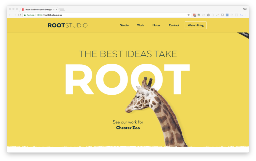
Typography sizes have increased pretty dramatically over the past few years on the internet. It’s due partially to responsive design – and ensuring typefaces are easy to read across devices – and it’s partially due to a shift in the way designers think about type.
In the early days of website design, many of the typography “rules” were carried over from print design. The result was smaller text, often in serif typefaces, for body copy. Headlines and subheads were proportionately larger, but nothing like what we see today. Commonly body text is somewhere around 16px, up from 10px to 12px just a few years ago.
There are more sans serifs in body copy as well, but there’s less of a trend regarding serif versus sans serif. Moreover, designers are opting for typefaces with a more uniform stroke width, open bowls and an average x-height. All of these factors contribute to readability.
The easier the text is to read, the more likely users are to scan and engage with the content.
Body copy isn’t the only place for large, readable typography. Lettering in hero headers and for headline and subheads have increased in size across the board as well. It’s common to see hero text in the 100px range – and that’s a good thing. With so much to filter through on the web, users need a design element that speaks to them right away.
2. In-demand content

It’s the content that truly makes a website great. From large, clear images and video to words that almost jump off the screen, good content is the foundation of a modern website design.
- Meaningful content that establishes a connection with users is useful, timely and helps them solve a problem.
- Content should be free from spelling or grammatical errors.
- Every element should have the same feel and direct the user on the same experience, such that text and imagery “say” the same thing.
- Content should be detailed and authoritative.
- Good content connects with users on an emotional level, whether it is encouraging them to read a story or buy a product.
- All content needs to be search engine optimized so users canfind it.
3. Responsive images
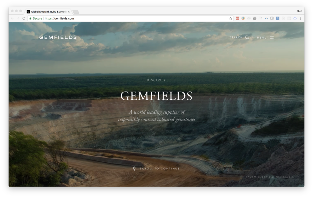
Users like a large visual display on your website. That’s why hero images – the oversized, full-width photos at the top of web pages – are so popular.
But those images have to look just as great on smaller devices as well, making it necessary to use responsive images that scale to the device viewing the website. Responsive images change shape and aspect ratio based on the device so that the image is sharp, clear and sized proportionately regardless of where the user accesses it.
Responsive images create a highly visual experience to which users respond.
Responsive images do something else as well. They ensure that content, including the image and any text or call to action overlays, are readable at every size. The content is more engaging and has a custom feel. (There’s nothing worse than visiting a website on a mobile device and having to zoom in on everything because the top image maintains the desktop shape and is tiny at the top of the screen.)
The same concept applies to every element in a website hero header, including video. Consider replacing the hero video with an image on smaller devices to speed up load times. Use a photo that mirrors the imagery from the video to maintain a consistent user experience.
4. Clear call to action

Every website exists for a reason. The design should lead users to that goal.
Simple buttons, easy-to-use forms and simple navigation elements can help convert visitors into website users or customers.
Every page should include a clear call to action (CTA) that gives users something to do once they have engaged with the content. Similar to typography, the size of the CTA has increased dramatically so that every CTA has a distinct presence on the page.
And don’t be shy about asking users to do something. The CTA should tell users exactly what to do, and what will happen during the engagement. Some CTAs are self-explanatory, such as a Facebook or Twitter share or “Buy Now” button; others might need a little more descriptive help. If you ask users to fill out a form, for example, tell them what they will get in return and how you will (or will not) use their information.
5. Consistent desktop and mobile user experience

If you don’t know what responsive design is by now, you need to do your homework. “Responsive design allows your website to adapt to the device your users are viewing it on. It provides you with the capability to write once and publish everywhere, meaning less work for you.”
The key benefit of a responsive website is that it should deliver a consistent experience across devices. There’s a little design work that goes into creating this type of user experience, but it should be the default thinking process when it comes to website projects.
If you aren’t building a responsive website … what are you doing?
The fonts, colors and imagery used should have the same look and feel regardless of environment or device. (Responsive design solves a lot of these problems for you.) In addition to the responsive website framework, carry these same design elements to everywhere you publish online – including social media – to create a consistent brand experience for users.
Conclusion
A modern website design is more than something nice to view. It actually creates authority for your brand and establishes trust with users. You’ve landed on those old-looking designs – admit it – and are immediately taken aback. Why haven’t they updated this website?
Don’t fall victim to that problem on your website. Audit the design annually. Look for components that seem out of place or that you don’t see in other modern design anymore. And update it. A website is an evolving content device, remember to treat it that way.
Down The Rabbit Hole