
Content precedes design. Design in the absence of content is not design, it's decoration.
— zeldman (@zeldman) May 5, 2008
 Article
How to ensure your design uses real content
We’ve been in the web development business for a long time, and we know that getting copy from clients is something resembling pulling teeth.
In fact we’ve delayed the launch of finished projects (sometimes for several months) because the page copy was not yet complete.
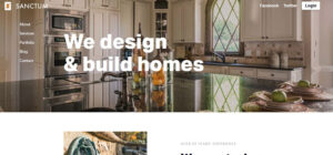
Building the design system with “dummy text” is not the same as using the real thing. Users need real and authentic elements to create a connection with your brand, and designers need these elements to help create that experience in the design. Although it’s become professionally acceptable to use filler text when designing websites, at best it’s lazy. At worst, it produces an end product that misses the mark.
The best designs start with copy that resembles the final product, and designers should be reluctant to work with anything less.
Here are some tips to ensure your design uses real copy from Day 1. (And your web design projects will be better for it.)
Design is NOT art
We should start by reminding ourselves that design is NOT art. It’s a discipline that encourages the user to conjure up an emotion or perform an action. When it comes to websites, this can be anything from navigating pages, reading content, clicking buttons, submitting information or making a purchase. Jeffrey Zeldman addressed this back in 2008, when he suggested: Content precedes design. Design in the absence of content is not design, it’s decoration.
And yet if web designs start without the production copy, that’s exactly what you’re creating: art. It seems counter-intuitive to design blocks of content without knowing what the copy will be, how much copy there will be, and without regard to what elements are most important. This is a discussion that is crucial to have with your client as early as possible. Remind them that you’re job is to help their brand deliver a message and move users through a site. You can only do that if you know the message, and if you have the supporting content to establish that message.
Tips to “find” content
1. Start by acknowledging your biases.
The curse of knowledge is a phenomenon that happens when you know a subject so well, you assume everyone else does too. Clients can think this way when they give you projects and designers can think this way when they’ve been working on something for a long time. But the problem is that no one else understands what the website or design is trying to say. And that’s why starting with a content plan, then moving to the design is so important.
Break out of the bias:
- It can be tough to describe or outline a business with content that can both fill a website and be engaging for users. And that’s OK. But it is your job to do it.
- Start by getting information from clients before you think about the first design element. Ask them questions about what they do, why it is important and who they are trying to reach. Stand your ground during the early phases to get this information before drawing wireframes – even if the client wants to see a design first. Filling in “blanks” of a design limits the free flow of content and crams information into preset boxes that might not actually work for the content at hand.
2. Make the assumption that your clients will not have a content strategy for their website.
The hard part is that you have to work with clients to find content. The process will be a little different for each project and each client, but you can rest assured that most clients will be the same: they won’t have any content waiting for you.
3. Schedule a series of calls with content stacks in mind.
Focus on bits of content in small increments, as groups of content that relate to a specific idea.
If you’re up for the challenge and you have the bandwidth, account managers should schedule a series of interviews that focus on very specific areas of the site. Use technology to help you capture the interview and refer to it later. Consider recording phone calls with Skype or Google Voice and have the conversation transcribed. If you are low on bandwidth, or have trouble extracting the info you need, hire a local journalist…asking the “right” questions is their core competency, and many of them moonlight as freelance writers.
4. Create the questions in advance
Begin building a boilerplate questionnaire and use this as a required checklist. HubSpot has a great list of more than 100 questions to ask a website client. Pay particular attention to the content section (questions 98-110) to help develop your own questions.
These include:
- Do you have a documented content strategy? (Request a copy.)
- What type of content will you publish on the site? (Get examples.)
- Will you be writing the content for the site? (If not, who will do the writing?)
- Have you created personas?
- Do you have photos and visuals for the site?
- Do you have an archive of previous marketing materials (brochures, mailers, seminars)
Consider sending these questions to the client in advance, so they have the opportunity to prepare.
Then use all this information to create content stacks for the initial design. Content stacks should include elements for each page, including all copy, necessary calls-to-action and navigational elements. Further, this content also includes visual elements such as photos or video, illustrations, branding elements and iconography. (No, you don’t just “come up” with these things in the design; they are part of the content.)
Content will change and evolve
In a perfect world, this is where design would begin.
But there is a catch…the content can and will change. In fact, it will likely require multiple rounds of editing and revisions … and that’s OK.
- You’ll want to test long headlines to see how they break and how readable they are. (Often content will take more space than anticipated.)
- Typesetting options will make a big difference as well. With real content, it’s easy to see if a typeface looks bad with the character combinations, takes too much space because of counts and font or word widths. It will also help the designer pick the best combination of typeface, size and style for the words that will be a part of the actual design.
- Remember, that it can all be subject to change and the design should account for inconsistencies. Designing with real content is a big bonus, but you can’t let it turn into a trap because you aren’t flexible enough.
Conclusion
The best thing about designing with the actual content is that the designer, developer and client can see the design as it progresses. They don’t have to imagine if the emotion established with the design works or not, because the corresponding words and images are right there on the screen.
It will also help you get to final publication quicker because the entirety of the design won’t have to get replaced. When using dummy text or images, it can be quite embarrassing when a user finds these unintended elements after launch. Don’t fall into that trap because you were lazy with design and content planning at the start of a project.
Down The Rabbit Hole