 Web Development
 Managed Hosting & Maintenance
 Fractional CTO

 Guide
Guide
Vectorform design lead Jon Yablonski created a website that outlines the Laws of UX late last year. The guide is a pretty amazing resource but got us thinking about how website design has changed – or evolved – design theory as we know it.
Here, we’re going to take a look at some of Yablonski’s laws of UX, as well as principles of design theory that have evolved with the digital landscape. Every one of these seven “rules” should be factors when planning and outlining website design projects.
Hick-Hyman Law (Hick’s Law)
This one sounds like common sense: Increasing the number of choices available to a user will increase the time it takes for that user to make a choice. This is important because you don’t want to make the design difficult for users. If they have to think too hard or mull over too many choices, they might abandon the website altogether.
Generally you want to give a user two options. Click this or that. Move forward or go back. Click this link or leave the page.
With only two things to choose from, most users can make a quick – even instantaneous – decision so that the interaction continues.
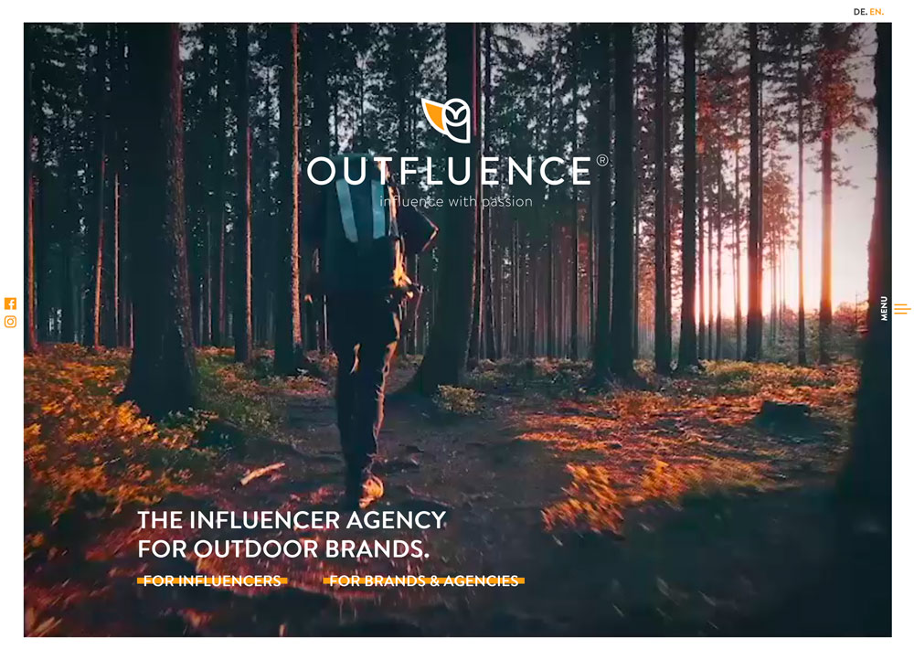
Outfluence, above, does this thoughtfully. The design has two tracks of content – for influencers and for brands and agencies. There are two buttons to choose the right path on the homepage.
CRAP
Not all website design theory is completely new. Some of the most basic design concepts have been around for a while and don’t change because of the canvas size or type.
CRAP – contrast, alignment, repetition and proximity – are long-standing fundamentals that most creative professionals are somewhat familiar with.
- Contrast: Elements in the design must create separation from each other, thanks to size, space or color. (This explains why call to action buttons are colors that don’t always “match” the design.)
- Alignment: Certain arrangements of elements are easier to read than others. The F-shape is the most common user pattern. Users read across the top of the page, then down the left and then across middle sections.
- Repetition: Repeated elements or objects or colors or words are most memorable. (This is why styles are vital. Thank goodness for CSS!)
- Proximity: Items or elements that are close together are relevant to each other. (That’s why the submit button is right next to the box where you enter an email address.)
Fitt’s Law

Fitt’s Law provides a simple explanation as to how elements should be sized and scaled in a design. When something is closer and bigger to the user it is easier and quicker to touch.
And that’s why buttons and calls to action are scaled up, or appear larger than you might think they should.
This use of size makes each element larger, more prominent and easier for more users to see and touch.
The takeaway is that any element you want users to interact with should be large enough to see at a glance and easy enough to touch (or click) on the screen. Make the buttons or click elements obvious and users will interact with them.
Taco Bill uses Fitt’s Law well. Each side of the design is actually a giant, clickable button. But the design – one side a full image and the other with plenty of white space – make them look different and scaling puts emphasis on each one individually.
Mere-Exposure Effect (Familiarity Principle)
The Mere-Exposure Effect is actually rooted in psychology. It is the “phenomenon by which people tend to develop a preference for things merely because they are familiar with them.”
You can see how this applies to website design. Users like established patterns for how things work and look. (Some creatives hate this idea because it can lead to more websites that have a similar look and feel.)
Regardless users are comfortable with designs that are:
- Similar in organization and function to other websites
- Use consistent patterns and actions within a single design
Quite simply, you don’t always have to reinvent the wheel with design projects for them to be effective.
Occam’s Razor

Occam’s Razor teaches us that the simplest solution is always the best. This is quite evident in design trends – minimalism, flat and material design – with a less-is-more approach to building websites and apps.
The root of this law is that simple solutions are easier to find and understand than complex answers to the same problem. (Makes complete sense, right?)
When it comes to thinking about website design, don’t overthink it. You don’t have to get every element on the homepage. (And you definitely don’t have to get all those elements above the scroll.)
Step back and take a broader look at the project. Incorporate the elements in a way that they don’t compete with each other so that every page gives users one thing to think about and one thing to do. The Interaction Design Foundation has a pretty great hypothetical case study on how to take all those elements that need to be in a design and streamline them into a more simple solution.
Note how in the example above, each element has plenty of space and hints of color are used to help direct users through the design.
Miller’s Law
The root of this law is up for debate – that the number of things the average person can remember is seven – but the application is that users remember chunks of information.
The application here is that you should group visual elements and information into small clusters of like parts that work together to maximize the users’ ability to remember the content. The easier these chunks are for users to understand and digest, the more efficiently the website can be used.
The big thing to remember is that it is hard to remember too many things at once. Don’t overwork users. Group elements so there are fewer overall things to think about.
Good design is invisible

When it comes to design, the best design is actually invisible to users. The average person should interact with and enjoy the design without thinking about how to use it or what it looks like.
This pleasant – and understandable – experience is the essence of invisible design. Users see it and like it, but don’t really know why.
This can be tough for people in creative fields, because we are trained to see all of these details and elements and how they work. Step back from the visuals and ask some real people to interact with design concepts: Do they engage with ease? What do they say about the design? Do they follow expected patterns and meet the correct goals?
The answers to these questions will help you figure out how visible your design is and what you can do to make it more usable and seamless. If users point out colors or fonts or specific design elements or techniques, the project is probably somewhat “overdesigned.” Look for ways to make it a little more subtle without sacrificing usability.
BellyQ has a simple design with just a big photo and text, with some subtle techniques applied. The eye goes from the center of the homepage to the reservations button. It’s effective without a lot of flashiness.
Conclusion
Did you see our article on Gestalt Theory? We took a deep dive into how an efficient user experience starts with this common principle that defines how users put all the elements together visually when they see a design.
You could call Gestalt Theory the eighth modern law of design theory. Even though the concept has been around for the better part of a century, it shapes how websites and apps are structured.
