

 Article
7 Best practices for practical (and actionable) UX writing
Unlike traditional copywriting, UX writing is a discipline focused on the actionable content that helps direct users in some meaningful way. Specifically, effective UX writing allows you to:
- Guide users to take action and achieve their goals.
- Motivate desired browsing behavior and interactions.
- Improve task completion.
With this in mind, we’ll start off by defining UX writing. Next, we’ll explore seven best practices that will help you create actionable copy for your web design projects.
What is UX writing?
UX writing, also known as microcopy, is the discipline of crafting user interface copy that directs the end user through a deliberate journey, addressing any concerns they have along the way. It embodies the brand voice in an attempt to humanize the business and create a personal connection with the user.
Some common instances of UX writing include:
- Call to action buttons
- Navigation menu labels
- Tooltips
- Success and error messages
- Form labels
- Headings
- Fine print
- Instructional copy
- Pop-ups
7 Practical tips for UX writing
Tip #1: Use simple language
UX writing needs to be simple, clear, and consistent throughout. Your users shouldn’t need to spend additional brain calories fumbling through your intention. Ideally, it should be simple enough for people to interact with intuitively and without realizing they’ve been guided in any particular direction.
Here are a few ways you can use simple language in your microcopy:
- Use easy to understand vocabulary. Save your creative juices for longer-form copy and keep your microcopy clear and straightforward. You should also avoid using difficult, technical terms. For instance, instead of saying Only alphanumeric characters are allowed you could say Use letters and numbers.
- End on prepositions. Ending phrases on prepositions makes your writing sound more natural and is easier to understand. What’s more is that it can also save you a word or two.

- Use a conversational tone. Using a conversational tone in your microcopy humanizes your brand, which has been proven to invoke trust. For instance, Yelp’s review system uses casual phrases like Meh. I’ve experienced better. and Woohoo! As good as it gets! instead of 2-stars or 5-stars.

There are a number of online tools (like Readability Test Tool, Gunning Fog Index, and Readability Formulas) that you can use to make sure your microcopy isn’t too difficult to understand.
Tip #2: Be concise
One of the primary characteristics of good UX writing is brevity … hence, microcopy. It’s vital that you keep your copy concise and meaningful. Keep in mind that the purpose is to nudge the user in a particular direction without being too obvious.
Quick tip: avoid using expletive constructions. For example:

Instead of saying something long and boring like There are hundreds of integrations with apps that you already use, MailChimp keeps it concise.
Here’s another example:

Tip #3: Test your copy
While getting feedback from your co-workers can certainly be helpful, some parts of your microcopy might be loaded with jargon. For this reason, it’s a good idea to test your copy out on various users — ideally, people who match your target audience.
If something isn’t immediately clear, then it should be reworked. If you have the bandwidth, consider an A/B test on specific sections of your copy (for instance, your call to action buttons) to see how people respond to it.
Keep in mind that the purpose of your microcopy is to guide the user from point A to point B. So, for testing, it’s best to build scenarios that require users to complete a path instead of asking them if the phrase Request a Quote makes sense. This allows you to optimize your copy for conversions.

Image Credits: Content Verve
Tip #4: Use images
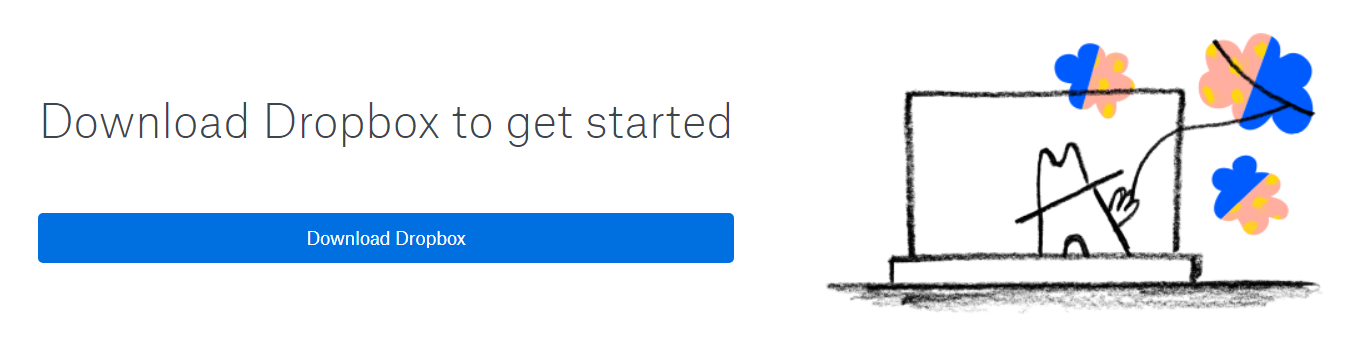
One way break up long onboarding instructions or make the 404 page a little less frustrating is by using some fun images. Using photos, images, illustrations, emojis, and even icons can help make the user experience more pleasant, make your copy memorable, and reinforce your brand in the user’s mind.
Dropbox uses illustrations to make their onboarding process fun:
And here’s a clever 404 page from Pixar:

Tip #5: Reflect brand voice
By using a vernacular that pairs well with your brand’s voice, you can give web visitors a feel for your brand’s personality. That said, it’s essential that you are consistent with the style you choose to reflect your brand’s voice (without being repetitive). Don’t use redundant adjectives to spice up your copy. Instead, get creative and think up of different ways you can use words to make a strong impression and encourage users to take action.
For instance, the Dollar Shave Club uses fun microcopy to communicate its brand to prospective customers.

Here are a few more examples:


Tip #6: Lead with the benefit
Generally speaking, people are reluctant to take action unless they know what they’ll get in return. They’re also trained to focus on the beginning of sentences.
Since a lot of your microcopy involves guiding the user down a path, start your sentence by explaining why they should take action. Instead of saying something like Use pull requests to review code with peers, GitHub leads with the benefit, i.e. Write better code, and explains the rest in the paragraph below it.

Tip #7: Make content scannable
Most of your website visitors aren’t reading — they’re skimming through content looking for the bits of text that are valuable to them. With that in mind, use structural elements (like headings, lists, text formatting, and columns) to make your content more scannable.


Bonus: weave content in iteratively
As you progress through the design phase, you might find yourself making a few iterations to make your design and copy more coherent. Microcopy influences design. Design influences a revision in the microcopy. So on and so forth.
The idea is to incorporate content into the process, as opposed to having it created in a silo that later needs to be “plugged into” your design. Your goal shouldn’t be to have launch-ready content before you begin designing, but rather the general idea. Which is why you shouldn’t require all content before design.

The Bottom Line
With deliberate UX writing, businesses can establish and communicate a vocabulary that defines their brand voice and guides the user through a purposeful journey.
Let’s recap the main points:
- Instead of using difficult phrases full of jargon, use simple language to guide users.
- Be concise with your microcopy while making sure it’s still meaningful.
- Run usability tests to gather feedback and (A/B) split tests to optimize your microcopy for conversions.
- Use images to deliver a delightful user experience.
- Use words that reflect your brand’s voice.
- Lead with the benefit instead of listing out features.
- Use structural elements like headings and lists to make your content scannable.
- Bonus: Microcopy influences design. Make sure you’re weaving content in iteratively.
What are some of the best examples of UX writing you’ve come across? Share your thoughts in the comments section below!
Down The Rabbit Hole