
 Article
5 Tips for accessible UX writing
UX writing enables businesses to establish their brand voice, guide users to take action, and make it easier to complete tasks.
So, how do you write accessible microcopy for people with impaired vision?
In this article, we’ll start by explaining how people who are visually impaired browse the internet. We’ll also share some tips for writing better, more accessible microcopy for your UI/UX design projects.
How do visually impaired people browse the internet?

People with impaired vision typically browse the internet using screen readers. Since visually impaired people can’t see the mouse cursor, they use keyboards.
Instead of using a mouse, they use the tab and arrow keys to navigate between websites and pages and the enter button to click links and buttons.
Screen readers read out elements as the user focuses on them and let them know whether they’re on a button, image, or text link. In other words, instead of perceiving the entire screen, people with impaired vision only know the element they’re focusing on at any given time.
X Tips for writing better, accessible microcopy

Tip #1: Use live text, not images
Many times, designers add text to images instead of using text and images separately.
As you can probably already guess, screen readers can only read live text from web pages. If you’re using an image with text on it to represent interactive UI elements or convey information, people using screen readers won’t know it’s there.
Here’s an example:
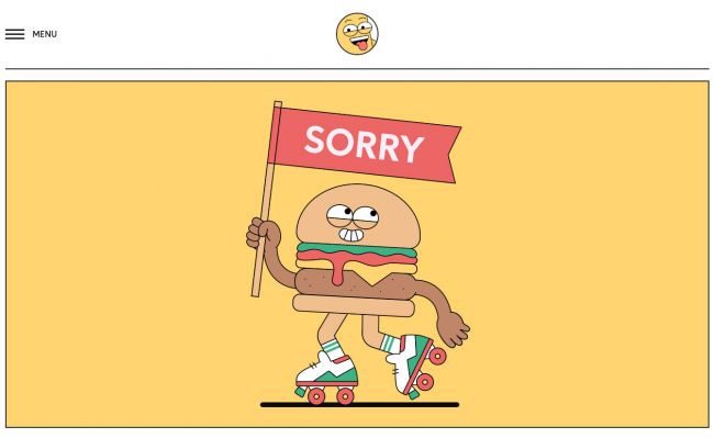
When a user with impaired vision lands on this page, their screen reader will only read out the alt text of the image. Unless the alt text is descriptive, the user might be confused about where they ended up.
The text you add directly to images goes unheard for anyone who’s using a screen reader to browse your website.
Instead of using an image as a button or creating an image with text on it to communicate instructions or information, use live text so screen readers can pick up on it.
However, if you absolutely must use an image with text on it, consider using alt text to describe what you’re trying to communicate. For example, if you’re using an image with clever microcopy on it to let visitors know the page doesn’t exist, your alt text could be something simple like Page Not Found.
Tip #2: Be mindful of the order of elements
If you’ve ever tried to browse websites using your keyboard, you probably already know that the tab button and arrow keys will advance you top to bottom and left to right. People with visual impairments similarly browse the internet.
In the context of accessible UX writing, you need to make sure you’re presenting any information the user needs to complete a task before they take action.
Let’s take a look at an example:
![]()
Notice how the name of the instruments and helpful tips are positioned under the clickable buttons? When a visitor using a screen reader visits this site, they’ll navigate between the icons first and then hear Stocks, Currencies, Commodities, and Indices later. Users would have to remember the order of instruments, go back, and make their selection.
Here’s another example:
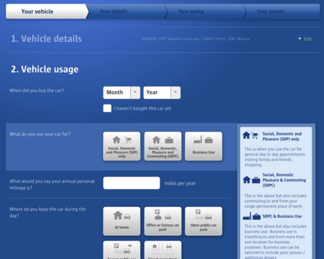
This fill-in-the-blanks style form delivers a poor user experience. Users with visual impairments will read half the sentence: What would you say your annual personal and then be prompted to fill in the field. If they continue reading to finish the sentence, they’ll have to navigate back to the form field to fill it out.
Instead, you should always position important instructions or information that visitors might need to complete a task or take action before the input field.
Tip #3: Don’t rely on visuals for context
Best practices for designing accessible interfaces indicate that you shouldn’t rely on visuals for context. The same goes for writing accessible microcopy.
Here’s a quick exercise: remove all visual elements from your screen and see if it’s still easy to understand where you are and what you need to do next.
Let’s take a look at an example:

Without the image, the microcopy doesn’t make a lot of sense. When a user with impaired vision lands on this 404 page, chances are they’ll be slightly confused. Remember, clarity trumps cleverness – especially when communicating error messages.
It’s also worth considering that visuals incite emotion. With accessible UX writing, you have to keep in mind that some users might not be able to experience the feeling cues like green ticks, smiley faces, and exclamation marks add to your web page. Keeping this in mind, write microcopy that incites emotion on its own – without the need for visual elements.
Tip #4: Create descriptive call to actions
Did you know that you can use your keyboard to navigate from one headline, link, or button to the next on a web page? People with visual impairments do the same thing as it allows them to get an idea of what the page covers quickly.
Here’s an example:

If a user decides to navigate between the buttons on this page, they’ll hear Watch Demo repeated over and over again. And if they jump from link to link, they’ll listen to Learn More six times without understanding which product it’s referring to.
Writing descriptive call to actions improves your site’s usability (and thus it’s user experience) for everyone – including users with visual impairments. Following our example, you could instead write Watch the Sales Cloud Demo or Try Quip for Free.
Tip #5: Add Alt text to images and icons
Whenever you include images or icons in web pages, remember to add alt text to them. For those unfamiliar, alt text describes the image in a few words and doesn’t appear anywhere on the screen.
However, whenever a visitor accesses your site using a screen reader, they hear the alt text you’ve added to your image instead of seeing the image. For this reason, it’s generally a good idea to add alt text to images and icons that convey some information or build context.
Let’s take a look at an example:

Tilda’s landing page lists out the company’s advantages using icons and a brief description. Adding alt text to the icons would help users with visual impairments better understand each point.
Adding alt text to icons is especially important when you’re improving your site’s accessibility. If you have images that represent actions (like hamburger icon for Menu or magnifying glass for Search), you should consider adding alt text that describes where they lead.
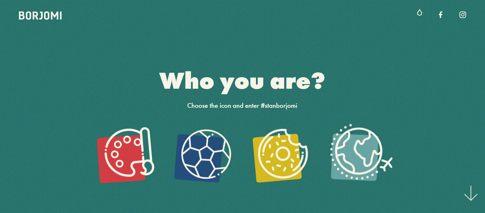
The clickable illustrations in the image above segment users based on their interests – arts, sports, food, and travel. Users with visual impairments, however, would need alt text to determine which illustration to click.
That said, you shouldn’t add an alt text to every single image on your website. For example, if you use illustrations or photos only to break up long paragraphs, then it’s best to skip adding alt text.
Simply put, add alt text to images, icons, illustrations, and photos that enhance the reader’s understanding or help build context.
Conclusion
Through accessible UX writing, you’re able to deliver an enhanced user experience to your site’s visitors – including those with visual impairments.
Let’s quickly recap the main points you need to keep in mind for writing accessible microcopy:
- Always use live text instead of images with writing on them.
- The order of UI elements should be accessible; information and instruction come before action.
- Write clear microcopy that doesn’t rely on visuals to convey relevant information.
- Create a descriptive call to action to give readers a clear idea of what to expect.
- Add alt text to images, icons, and illustrations that enhance the user’s understanding or build context.
Do you agree that accessible UX writing improves the user experience for everyone who visits your site? Share your thoughts in the comments section below!
Down The Rabbit Hole

