 Website Development
 Managed Hosting & Maintenance
 Fractional CTO

 Guide
Guide

 Article
Secrets of card-based web design
Remember trading cards as a kid? From Pokemon to sports figures, cards were tiny containers filled with information about our favorite characters.
The same concept holds true for cards in website design. A card-based design can create a framework of tiny containers, each holding one key piece of information. And while cards aren’t new, the style is in somewhat of a renaissance period thanks to the popularity of Material Design patterns.
Card-based design 101
The first secret to card-based design is understanding what a card is (and isn’t).
Cards are containers for information. The best card-based styles stick to the idea that one card equals one thought. That one thought can be a piece of information in text form, a photo or video, or even a link to outside content.
According to Google: “Cards are a convenient means of displaying content composed of different elements. They’re also well-suited for showcasing elements whose size or supported actions vary, like photos with captions of variable length.”
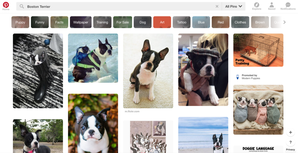
These containers are designed in a grid-based format that allows multiple cards to fill the canvas at one time. The grid can be fluid, with cards that all have a similar look and feel and populate with a scroll (think Pinterest) or cards can work as a series of singular elements that fill the screen (think Twitter).
Cards have grown in popularity for two reasons:
- They are a key component of Google’s Material Design style, which the creative industry has begun to embrace.
- They are effective on any screen size and provide a consistent user experience from desktop monitors to mobile devices because the format responds well to any screen size.
Advantages of card-based styles
Card-based designs are user-friendly and follow commonly accepted navigation and flow patterns thanks to use by a handful of web giants. Interacting with cards is easy and intuitive because they feature a format users understand.
And guess what? It’s likely that you’re already completing the activity necessary to establish a hierarchy for container elements.
The biggest advantage for creative teams might be that cards make it easy to organize information. It’s possible that card-sorting is something your team uses in the planning process, this takes that activity and applies it to the design as a whole.
The design pattern has other advantages as well:
- Cards can make content easy to digest by organizing complex information in a meaningful way.
- Almost any type of content works well in a card.
- Cards can be used with any type of aesthetic pattern – flat, material, ornate, minimal – and they look good.
- Cards work seamlessly from screen to screen and with click or tap actions.
- Content in cards is shareable on social media (in part because most social media platforms make it easy to share this type of content).
How to use cards in your designs
While a card can hold any type of content, there are some uses that make more sense than others. Effective cards showcase content in a manner that’s simple and scannable.
Here’s another secret to using cards: Users shouldn’t have to think about it. When a user comes across a card-based design, interactions should be second nature.
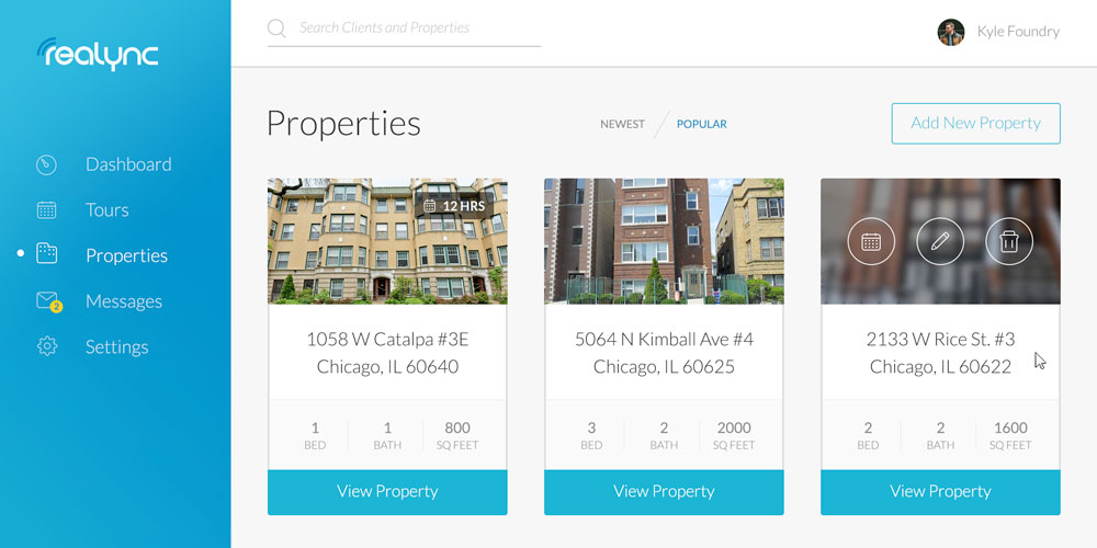
- Use cards to create a dashboard to organize varying categories of information.
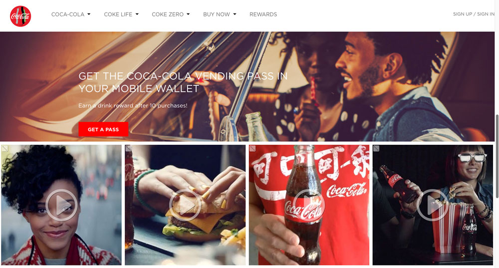
- Use cards to create a stream of content – a la Facebook or Instagram – that encourages users to scroll.
- Use cards to provide a consistent visual experience with content of different types, such that one card holds text and another links to a document and a third plays a sound clip, but they all share the same, unifying design.
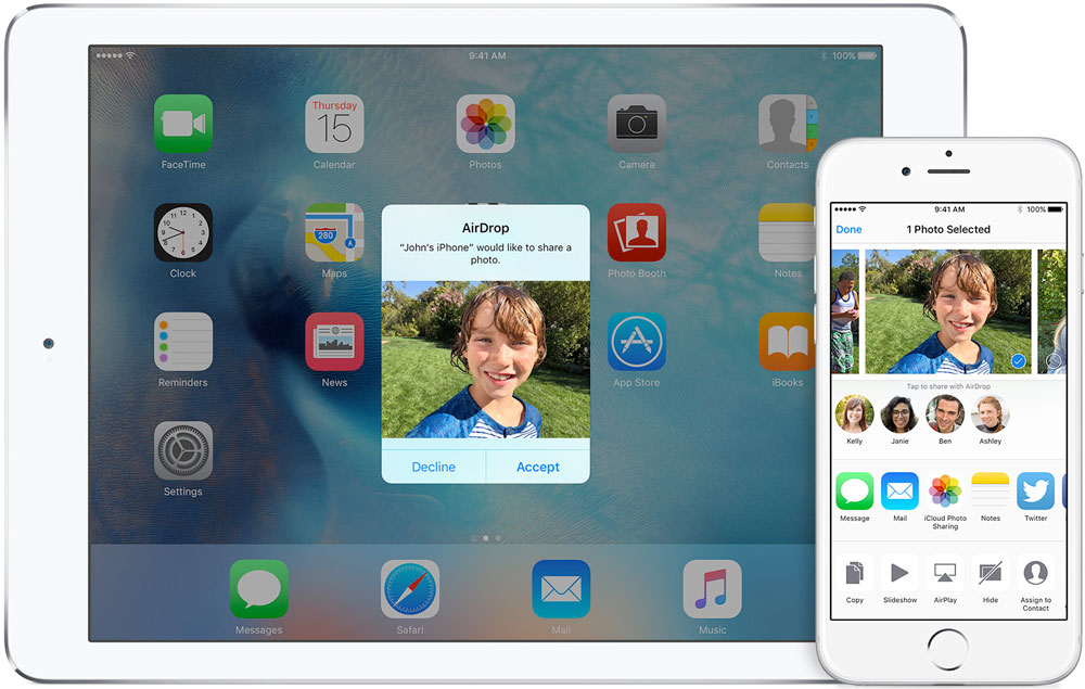
- Use cards to ask questions, provide alerts or show notifications. (Apple does a great job of this with pop-ups in its iOS for features such as AirDrop.)
- Use cards to encourage discovery of new elements by mixing queried content with related items.
- Use cards to manage workflows, create idea boards or other user-generated content.
- Use cards when you want content experiences to look and feel the same across devices.
Design an effective card
Now comes the hard part: Designing the card aesthetic.
The secret? Keep it simple. The complexity of cards is in the stacking mechanism. When each individual card is among dozens of others, the design looks complex so the visual components of each card need to be as simple as possible.
- Keep the content focused: Each card should contain one idea.
- Go big with imagery: Great images sell individual cards. Even though cards are small, sharp, crisp images are worth the extra effort.
- One action per card: Users should only be able to do one thing with a card. Don’t include multiple links or clicks. In fact, the whole card could be an active link.
- Include plenty of space: Don’t look at card-based styles in isolation. With multiple cards on the screen, things can get tight quick. Include plenty of whitespace inside each card and between cards to avoid visual overload.
- Stick to a grid: Organize cards in a distinct grid. Set a number of columns and format for different screen sizes.
- Use common width and varying heights: Cards need to be consistent in style, but that does not mean they must be identical. Use a set width but consider allowing a flexible height. This will give the cards an almost masonry look. Visual hierarchy will draw users to cards because of the variance.
- Layer cards on a background: Go back to the layering concept of Material Design so that cards “rest” on a canvas. The added depth provides visual interest and creates a more polished look.
- Provide options for sort and collapse: If the use case makes sense, be sure users can arrange cards as needed.
- Use simple typography: Because cards are tight elements (and because there are often several of them on the screen at once) clean, simple typography works best. Pick one typeface for cards. Consider a typeface with a regular width and strokes. Thin or thick typefaces can get lost or feel cluttered.
- Add an unexpected detail: Make card styles your own. Not every card has to be a perfect square. Consider cutting out a corner, using rounded edges or a bold color pattern to make your cards stand out.
Cards are a great tool to have in your idea arsenal. For projects where the information architecture has the potential for complexity, consider this concept to help manage content.
And don’t forget: One piece of information per card. If you try to do any more than that, you’ll lose what makes the simplicity and style of cards so charming and usable.
Down The Rabbit Hole