
 Article
How to create the right animation for web design projects
It seems like almost every client is demanding some type of animation for their website these days. They don’t always know what that animation should be, or what it should do, but they want animation.
That can leave you in a bit of a pickle. How do you create the right kind of animation for each website project? How do you know an animation will meet website goals and engage users?
What you need is a plan for animations that help sell the benefit of your client’s website. Here are a few ways to do it.
Logo or brand animation
There’s no rule that says a brand mark or logo has to be still. Consider animating it to draw attention to the website’s brand.
From website placement to use on social media, animated logos are a trending design element and a nice way to create some engagement and help draw users into website branding. (And maybe even solidify long-term loyalty.)
The animated logo is a must-have element if you want to drive engagement with your brand in a modern way because the days of the static logo are over.
Use this technique: Almost any design can benefit from a simple logo animation. It doesn’t have to be complex to be effective. (Just look at all the options for Fubiz, above.)
Load screen animation

While a loading screen animation can be kind of a trick, it can help keep users interested in the website while heavy elements load. (The trick is that a loading animation keeps the user from noticing that a website is slow to load.)
While we don’t recommend building a website that’s slow, it can happen at times. (We’ll just blame the service provider for these lags.)
Create a loading animation that will delight users as they get into the design. Jony Guedi’s design does a great job with a simple loading animation that looks like it is part of the content. The film director’s page uses the rainbow colors from an old-style film moving into place as the site loads. It’s clever, interesting and feels like part of the design. (Users won’t even notice any loading lag.)
Use this technique: This technique is best for websites that have the potential to load slowly or want to lead users to the content in a specific way.
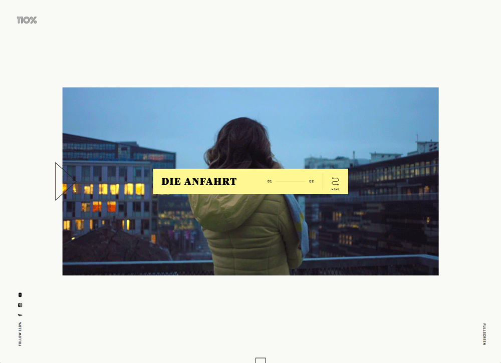
Navigation or directional animation
A simple animation can provide a lot of information in a website design as well. Consider navigational or directional movement that helps users navigate the design.
These types of animations are particularly important when it comes to designs that include long-scrolling formats or unusual user scroll or interaction patterns. An informational icon with a hint of movement, such as a bounce or color shift, can draw the user’s eye and help them understand what they are supposed to do with the design next.
These animations should be subtle, consistent throughout the design (if they are included on multiple pages) and intuitive. If the user has to think too hard about how to use the animated element, it’s too complicated and should be redesigned.
Use this technique: Designs with unconventional user patterns or long-scrolling features can benefit from the additional navigation element.
Explainer animation

Sometimes the goal of an animation is to explain how something looks or works. This is a key component of animation for websites that sell a physical product. Shoppers can’t always touch the item before making a purchase, but a great animation can help them decide to buy.
Explainer animations often come in the form of short videos, such as Bellroy (above). They can also include 360-degree product views and images that seem to move when the user interacts with them.
Often explainer animations are different than other animated effects because they require some user engagement to activate, rather than just happening when the website loads.
Use this technique: Users are beginning to expect more immersive experiences for e-commerce, making this a great idea for websites that sell physical products.
Hover animation
Hover animations happen when the user moves the mouse over an element and it changes in some way. Common hover animations include color changes, a balloon effect where the element gets larger or a simple glow or shift.
The animation tells the user that the element is actionable and is a signal to click it. (Animating your call to action buttons can increase clicks and conversions. Try it out. Clients will love you for it!)
The great thing about hover animations is that they add a little extra character to the design. You can bring an element to life in a way that a still element does not. That little extra delight you provide a user can turn them into a fan of your site in an instant.
In the example above, every clickable element in the design has a hover state, ranging from bold to subtle. Note the arrow next to the video. The stroke moves from a thin to thick outline in the hover state, encouraging a click. (Plus, the direction of the arrow leads users into the video to the right of it.)
Use this technique: Almost any design can use hover animations, particularly to encourage button clicks for CTAs.
Subtle animation
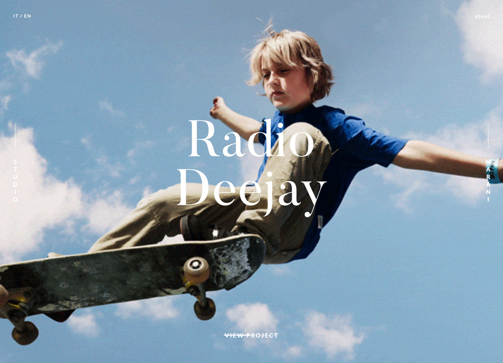
Sometimes the subtlest movements can have the most impact. From cinemagraphs, which are still images that have small movements inside of them, to sporadic movements inside a full-screen illustration, these little actions can delight and entertain users.
They can also help keep people on the website longer because they want to see the interaction again or see what other little surprises might come their way.
Note in the design above, the only movement is the boy’s hair. It’s moving in the wind. Each image on the scrolling header of the website design includes a similar, cinemagraph-style animation. (The trick here is that users will actually watch the entire scroll just to see what part of each image comes to life.)
Use this technique: If you need to keep users on a design for a longer time, consider subtle animations.
Conclusion
While it can seem overwhelming at first, adding animation to a client design isn’t that complicated. Think about the goals of the project to choose the type of animation that best suits the framework.
And the best part is that clients will thank you for suggesting an animation with a purpose that actually contributes to the overall design, and doesn’t just decorate the background.
Down The Rabbit Hole