 Website Development
 Managed Hosting & Maintenance
 Fractional CTO
 Guide
Guide

 Article
Designing UI with color blind users in mind
Color plays an integral role in UI design. When done right, it improves user experience, influences purchasing decisions, and reflects the brands voice.
So, how do you design effective, accessible, and aesthetically pleasing interfaces for color blind users?
While the science behind color blindness is pretty complex, the gist of it is that color blind people have difficulty seeing color clearly or differentiating between some colors. With this in mind, in this article, we’ll share some tips on how you can improve your site’s accessibility and the experience it delivers for color blind people.
Color blindness in a digital world
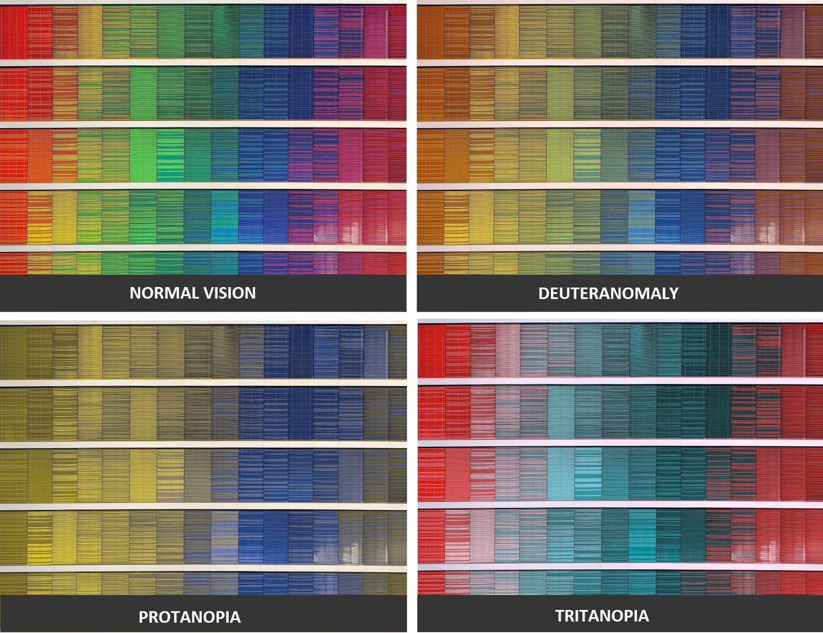
According to studies, approximately 1 in every 12 men (and 1 in every 200 women) are color blind. Although color blind people can see things just as clearly as everyone else, they aren’t able to fully discern red, green or blue light. There are different types of color blindness; deuteranopia and protanopia color blindness are the most common.
People with red-green color blindness (deuteranopia) have difficulty distinguishing between red and green. Similarly, to people with red color blindness (protanopia), all red colors look dull.
What this means from a design standpoint is that relying on color alone for readability and affordance would make your website difficult to use for someone who is color blind.

You can use the Coblis Color Blindness Simulator to see what your site looks like to color blind users.
7 Ways you can improve color accessibility for color blind users
Design elements and techniques that improve color accessibility for color blind users are generally considered to be good design practices. While you might think that your website’s aesthetic appeal might suffer if you design for accessibility, that’s certainly not the case.
Here, we’ll take a look at some of the ways you can design a more accessible UI keeping color blind users in mind.
#1: Use patterns and textures
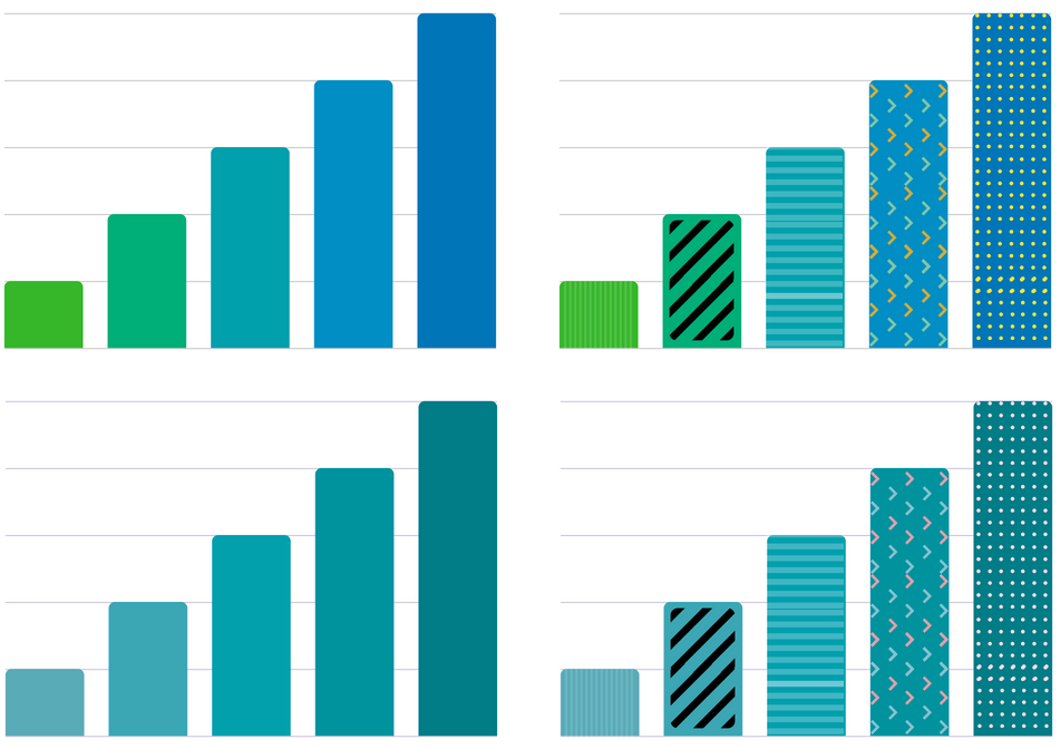
Color differences are incredibly important with data visualization e.g., graphs and pie charts. Choosing colors that have a low contrast ratio can make your chart difficult to interpret for color blind users.
Here’s what you should do instead:
- Use patterns and textures to make it easy for users to differentiate different segments.
- Add text labels to segments to make them even easier to understand.
Let’s take a look at how a color blind person with tritanopia might see a blue-green bar graph versus how they’d see the same graph with patterns and textures.
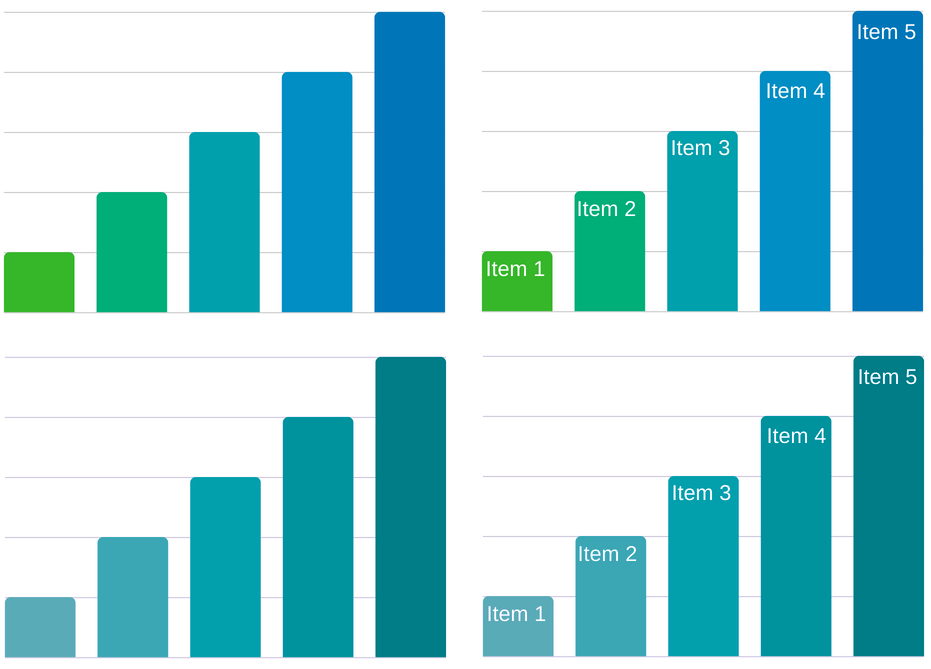
Here’s what it would look like if you labeled each segment instead of using patterns:
#2: Utilize colors and symbols
You shouldn’t rely solely on color to communicate errors or convey information through your UI.
Let’s take a look at Facebook’s sign up form for example. If the form relied on color alone to let users know they had made a mistake on a particular field, it might look something like this for a red-blind (protanopia) user:

Here’s a look at Facebook’s sign up form with symbols and error messages attached:
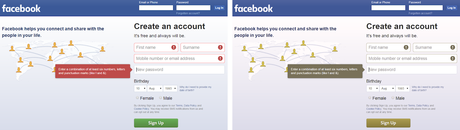
Using icons and symbols in forms to let the user know that they’ve made an error improves accessibility and helps them correct their mistake faster.
#3: Use text labels
Adding text labels to color filters and swatches improves accessibility for color blind users. Depending on the type of color blindness, users might find it difficult to differentiate between different colors (or shades) without some sort of descriptive text.
For example, without the descriptive text label on Amazon, color blind users wouldn’t be able to tell a red shirt apart from an orange or green one.
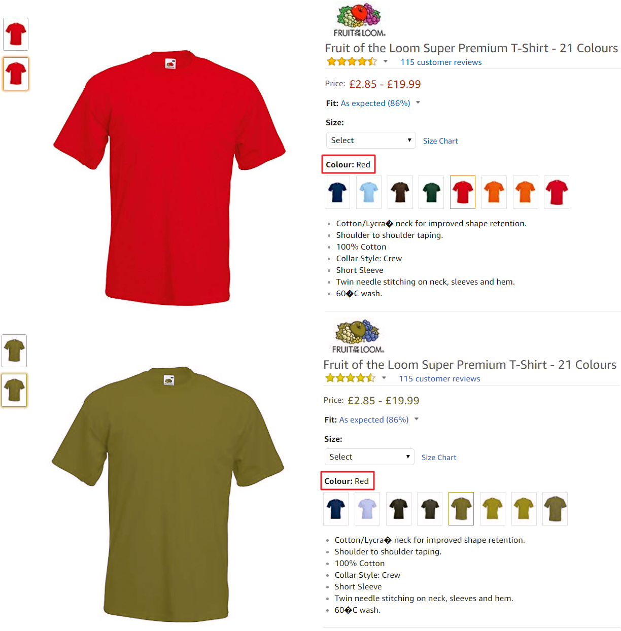
Adding text labels to color filters improves accessibility for people with normal vision, as well. For example, white, off-white, and light grey are often difficult to differentiate between on monitors.
#4: Underline links
A lot of the time we use font color or font weight to denote links. While it may be possible for someone with deuteranomaly, protanopia, or tritanopia to distinguish anchor text from regular text, it’s certainly not ideal due to the low contrast ratio.
Someone with monochromacy wouldn’t be able to differentiate between text and anchor text at all and would have to hover over the text to see if it their cursor changes to a pointer.

For this reason, it’s a good idea to add an underline to text links. This makes it easy to immediately tell regular text and anchor text apart. Here’s an example from the Engadget website:

#5: Color combinations to avoid
Certain color combinations aren’t ideal for color blind users either because they have low contrast ratios or because they’re difficult to differentiate between.
Here’s a list of color combinations that you should avoid using in your interface designs wherever possible:
- green-red
- green-blue
- green-brown
- green-black
- green-grey
- blue-grey
- light green-yellow
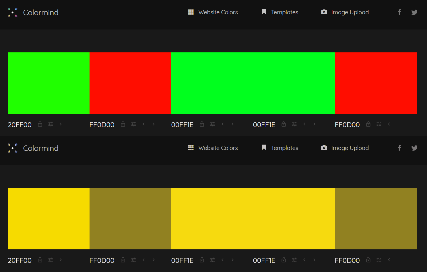
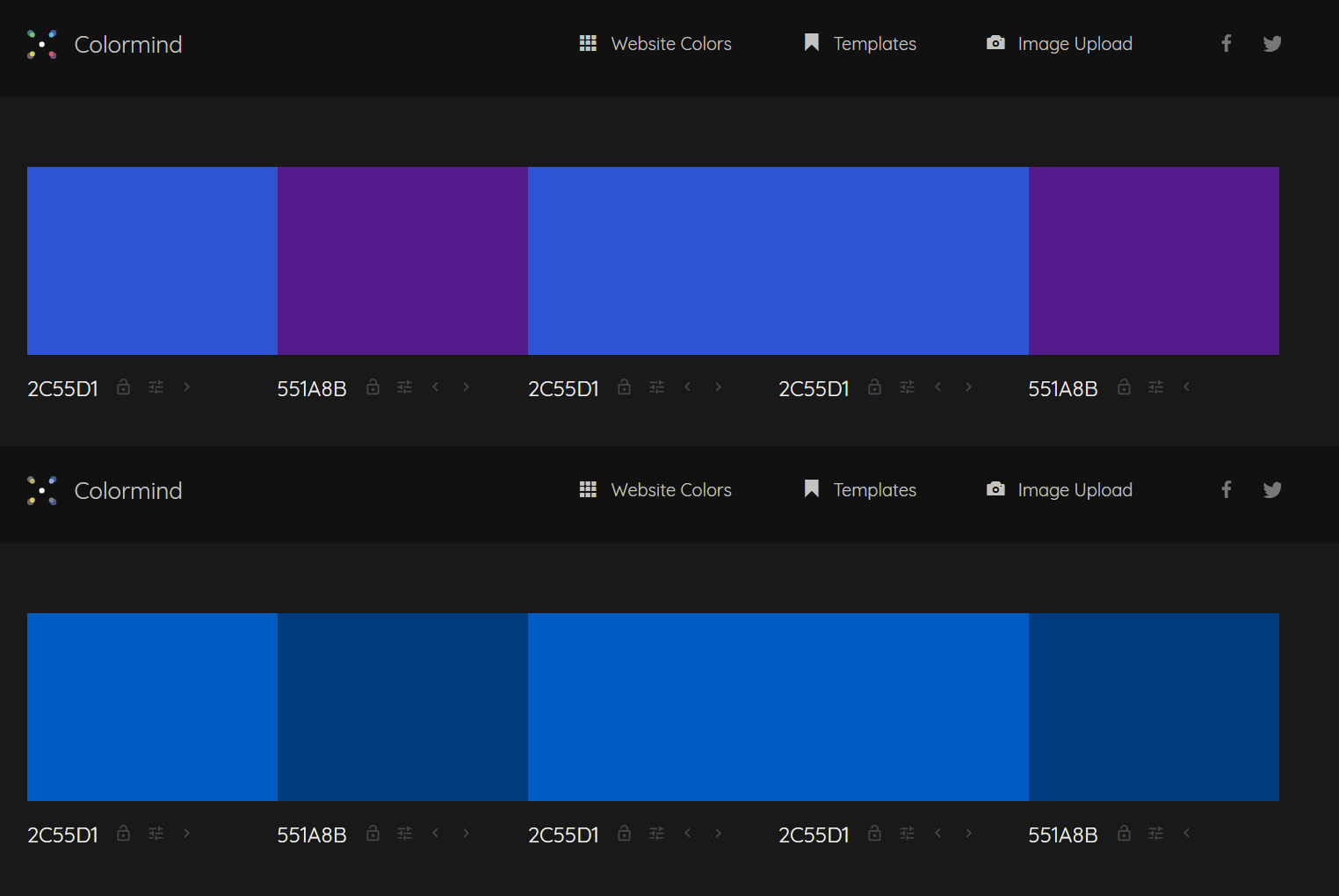
- blue-purple
Here’s what green-red and blue-purple color combinations would look like to a user with protanopia:
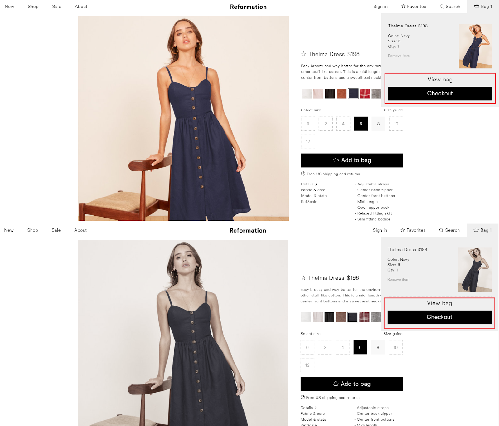
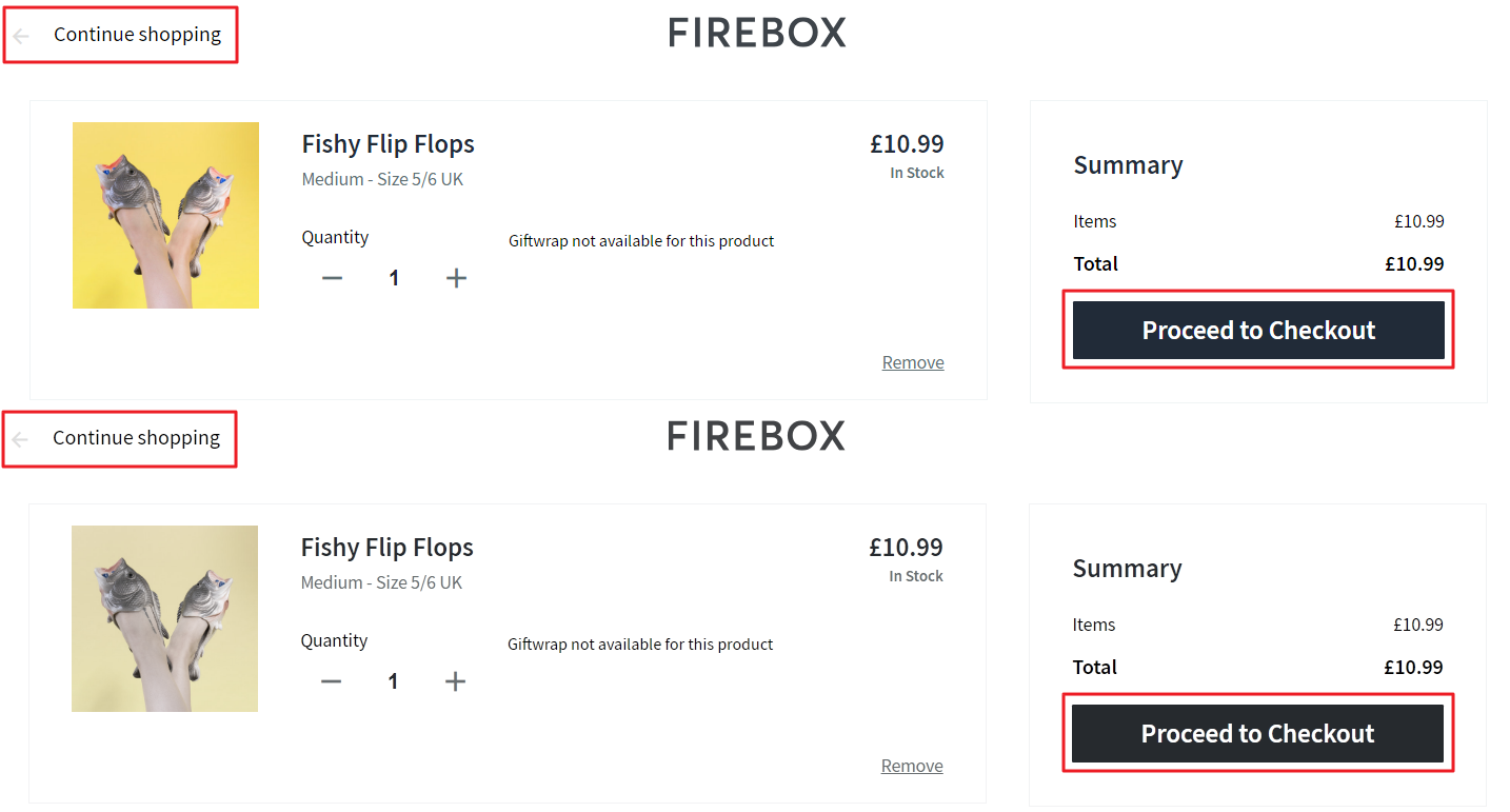
#6: Make primary buttons standout
Many times, designers rely on color to make primary buttons stand out. The problem with this is that the color you use may be difficult for color blind users to perceive.
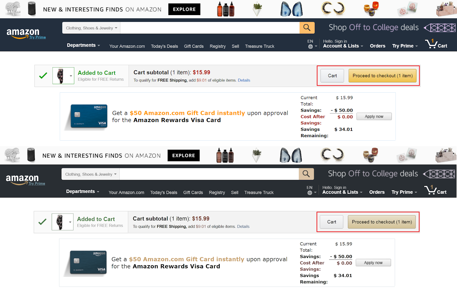
Here’s what you should do instead:
- Increase the size of your primary button.
- Try out different placement combinations.
- Increase contrast between primary and secondary buttons.
- Use borders, icons, or font weight to differentiate primary and secondary buttons.
For example, Reformation uses size and color to emphasize the primary button.
And Firebox presents their primary button in the bottom-right corner and the secondary button in the top-left corner.
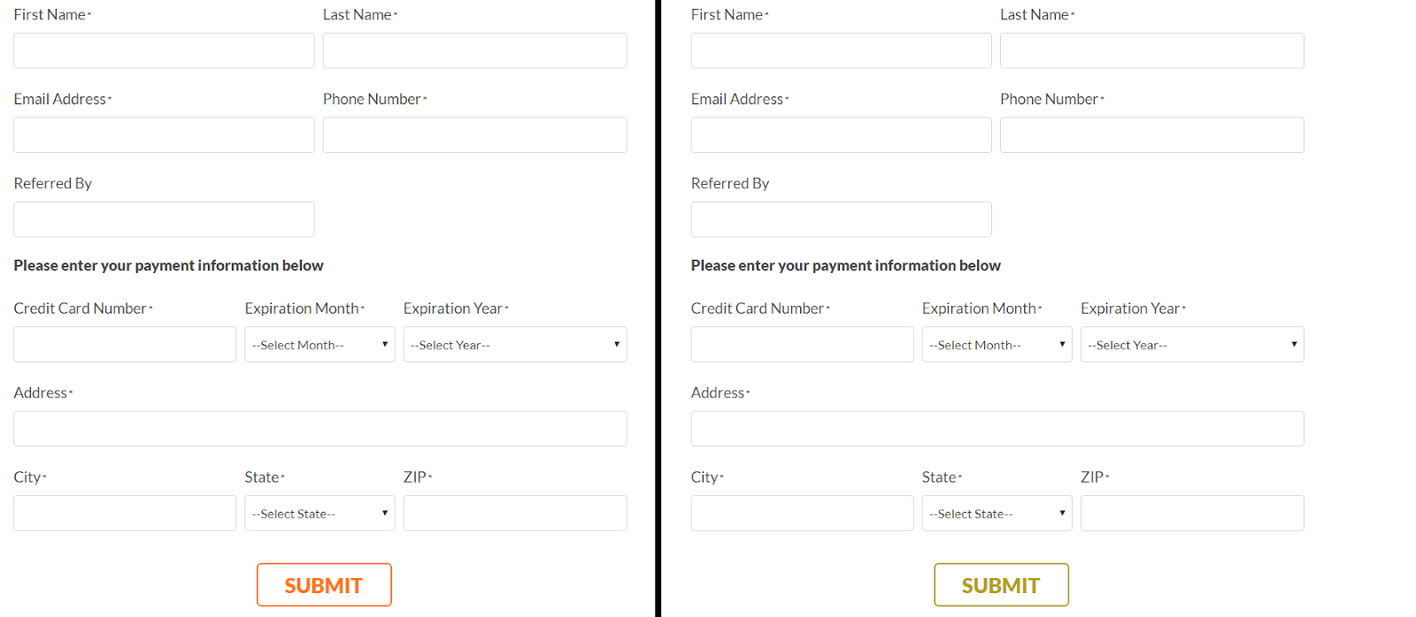
#7: Mark required form fields
Color blind users may have difficulty differentiating between required and optional fields if you use color alone to denote required fields on forms.
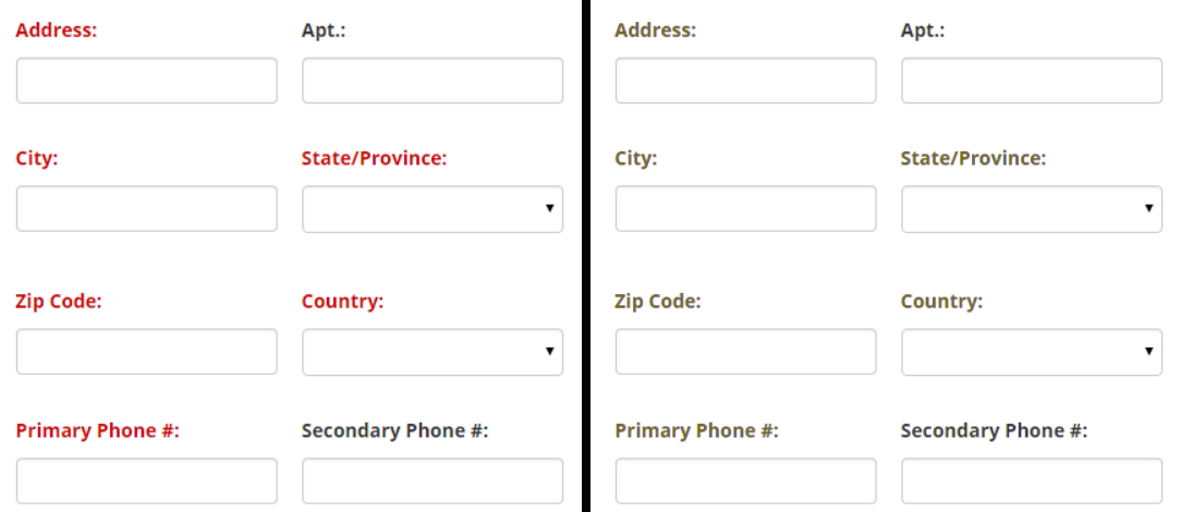
Instead, you might:
- Mark required fields with an asterisk (*).
- Label fields with the word Required or Optional.
- Remove optional fields from forms.
Conclusion
Designing UI for color blind users will help you improve your site’s accessibility for users with normal vision, as well. Although there isn’t a one-size-fits-all solution when it comes to web accessibility, here are a few tips you should keep in mind:
- Use patterns and textures to show contrast in graphs and charts.
- Use colors and symbols to convey error messages.
- Add text labels to color filters and swatches.
- Underline links to differentiate between regular text and anchor text.
- Avoid using poor color combinations such as green-red and blue-purple.
- Use size, placement, or font weights to make primary buttons stand out.
- Mark required form fields with a symbol (such as an asterisk) or label them.
What are some of the ways you improve website accessibility for color blind users and users with normal vision? We’d love to hear from you so let us know by commenting below!
Down The Rabbit Hole