
 Article
10 Usability heuristics that all UI designers should know
Heuristics provide general guidelines that UI designers can reference to perform usability audits on their projects. Although usability heuristics won’t give you the best possible answer, you can run a heuristic evaluation to:
- Get quick feedback early on in the design process.
- Determine the best corrective measures to take.
- Use with other usability testing methodologies (such as card sorting or tree testing).
- Conduct usability testing to identify potential design issues.
With this in mind, we’ll quickly define heuristics before exploring Jakob Nielsen’s 10 Usability Heuristics for User Interface Design in detail and look at some real-world examples.
A Note on usability heuristics
Before we get into usability heuristics, it’s important to understand what heuristics are.
Heuristics are guidelines derived from an experience-based approach to problem solving. They don’t aim to provide the best possible answer, rather a good enough answer. For this reason, heuristics aren’t proven solutions and shouldn’t be taken as strict rules. Simply put, heuristics are broad rules of thumb and not specific usability guidelines.
10 Usability heuristics for user interface design
Jakob Nielsen’s 10 Usability Heuristics for User Interface Design are the most widely used usability heuristics for UI designers. The heuristic evaluation is most effective when it’s carried out before and during the user testing phase of the design process. This is because heuristics are most effective when they’re used in combination with other usability testing methodologies.
Here’s what you’ll need to conduct an effective heuristic evaluation:
- A list of tasks that you’re evaluating.
- 3 to 5 evaluators who are experts in the field.
- A set of heuristics to use as guidelines (such as Jakob Nielsen’s usability heuristics, which are detailed below).
#1: Visibility of system status
“The system should always keep users informed about what is going on, through appropriate feedback within reasonable time.”
Without appropriate feedback, there’s no way for the user to know what’s happening behind the scenes. For example, if a user is waiting for something to load, the actual load time they experience will depend mostly on their internet speed. And if they don’t receive some sort of response from the system, they wouldn’t know whether to wait, repeat the action, or take another action.
According to this heuristic, you need to provide feedback to the user within a reasonable amount of time. You can provide feedback by displaying a progress bar, loader, change in color, or a push notification to inform the user about the expected time until the action completes.
Amazon has its navigation menu items set to underline when a user hovers over them.

And when you upload a file to Google Docs, it tells you how much time is left and displays a countdown timer that depicts it visually.

And once the file has uploaded, it displays a green check mark:

#2: Match between system and the real world
“The system should speak the users’ language, with words, phrases and concepts familiar to the user, rather than system-oriented terms. Follow real-world conventions, making information appear in a natural and logical order.”
This heuristic is about avoiding system-oriented terms and speaking to your users in their language. For example, Error: path X1212 not found might not mean much to an average user as compared to This username doesn’t exist in our directory, which informs the user that the username they’re trying to log in with isn’t registered.
It also states that you should provide information in a natural and logical order. In the context of e-commerce, adding products to a shopping cart is something just about everyone is familiar with.

As a UI designer, you want to make sure you’re not mixing jargon into your microcopy. Bonus points for using vernacular that matches your brand’s voice to reach out to your target audience.

#3: User control and freedom
“Users often choose system functions by mistake and will need a clearly marked ‘emergency exit’ to leave the unwanted state without having to go through an extended dialogue. Support undo and redo.”
Navigational mishaps and accidental deletes happen all the time. Wherever possible, you should give users the option to undo any unintended actions they may have taken.
When you delete an email in Gmail, you see a notification message displayed across the top of the screen giving you the option to undo the action and restore the email thread.

Similarly, you can support undo and redo by giving users the option to:
- Navigate between screens (e.g., forms) without losing information.
- Cancel a download before it completes.
- Remove items from their shopping cart.

If a user accidentally clicks the download button, they shouldn’t have to wait for the download to complete before they can exit out of the process.
#4: Consistency and standards
“Users should not have to wonder whether different words, situations, or actions mean the same thing.”
Consistency breeds familiarity. Maintaining consistency across your site in terms of design and how information is presented helps users better understand what will happen if they take a particular action and increases memorability. Here’s how you can implement consistency in your design projects:
- Page elements. A button on one page should look the same (size, shape, color, font, hover effect) across different pages on the website.
- Your choice of language. If you use the word Submit on one page and Send on another, it may be confusing for some users to understand what happens when they click the button.
- Layout. Reserve commonly used spaces on the page for the graphical elements users expect to see there. For example, logos are generally in the top-left corner and search bars in the top-right corner.


When you’re designing a website or writing microcopy for it, make sure that actions, terminology and commands are consistent throughout.
#5: Error prevention
“Even better than good error messages is a careful design which prevents a problem from occurring in the first place. Either eliminate error-prone conditions or check for them and present users with a confirmation option before they commit to the action.”
Letting users know they’ve made a mistake through clear and helpful notices makes for good user experience. But if you’re able to prevent the mistake from occurring in the first place, that’s even better.
For example, if you use the word attachment or attached in your email without actually attaching the file, Gmail lets you know that you forgot to attach the file and asks you if you’d like to send the email anyway. This is an example of the feedback approach of error prevention.

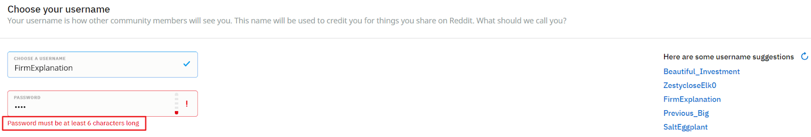
Here’s how Reddit notifies users that their password isn’t long enough at registration:
Another way to prevent users from making mistakes is by providing constraints. For example, if you’re designing a form that asks users to enter their birthday, you could split up day, month, and year into three separate fields in order to prevent users from entering their day of birth in place of the month of birth or vice versa.

However, it can be difficult to understand where a user is likely to make a mistake. Usability testing allows you to put your designs to the test and see how users interact with it.
#6: Recognition rather than recall
“Minimize the user’s memory load by making objects, actions, and options visible. The user should not have to remember information from one part of the dialogue to another. Instructions for use of the system should be visible or easily retrievable whenever appropriate.”
This heuristic can be interpreted in a number of different ways. A menu (or navigation) system is a classic example of recognition in user interfaces.
For example, if you’re browsing Amazon for camping and hiking gear, it shows you different navigation options across the top of the screen (to browse other outdoor recreation categories) and in the sidebar (to refine your search).

Similarly, when you’re using Google Docs and you want to hyperlink some text, you can look at the formatting options in the toolbar and recognize the link icon to be the one for which you’re looking. Recognizing the link icon is far simpler than recalling its corresponding keyboard command.

#7: Flexibility and efficiency of use
“Accelerators — unseen by the novice user — may often speed up the interaction for the expert user such that the system can cater to both inexperienced and experienced users. Allow users to tailor frequent actions.”
Keyboard shortcuts, personalized user interfaces, and advanced options are all examples of ways expert users are able to speed up their interactions with applications. For example, when you search for images of cats on Google, you can pop open the Tools menu item to refine your search.

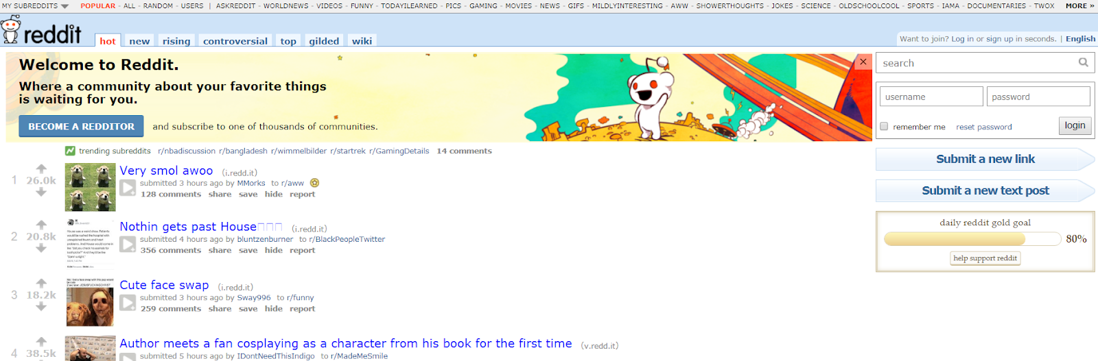
Reddit was recently redesigned but it gives users the option to visit Old Reddit, which is more efficient for some users.

#8: Aesthetic and minimalist design
“Dialogues should not contain information which is irrelevant or rarely needed. Every extra unit of information in a dialogue competes with the relevant units of information and diminishes their relative visibility.”
This is incredibly important when it comes to UI design and one of the best examples is Google’s search page. It’s a minimalist, distraction-free design that prompts the user to search for what they’re looking for. This is inline with the page’s goal: to facilitate search.

Compare this to Arngren:

It’s difficult to determine the purpose of this ’90s website. Is it an online store? A directory? Ask yourself if all of the information that’s presented on the screen is relevant or useful to the end user. If it isn’t, remove it.
#9: Help users recognize, diagnose and recover from errors
“Error messages should be expressed in plain language (no codes), precisely indicate the problem, and constructively suggest a solution.”
This is a mixture of some of the other heuristics we covered in this article. Here are some best practices you can follow to help users recognize, diagnose and recover from errors:
- Give feedback (in the form of a notice or inline message) that lets the user know how they can correct the error.
- Communicate error messages and notices in simple, easy-to-understand language.
- Allow users to undo mistakes (e.g., by going back) or exit out of the system.
- Prevent errors as they happen whenever possible.
For example, Kualo’s 404 page gives users the option to go back (undo mistake) to where they were.

Pro tip: A little bit of microcopy goes a long way to guide the user in a particular direction.
#10: Help and documentation
“Even though it is better if the system can be used without documentation, it may be necessary to provide help and documentation. Any such information should be easy to search, focused on the user’s task, list concrete steps to be carried out, and not be too large.”
Even though most users are able to use websites and applications without having to refer to their tutorials, providing help and documentation is necessary. Some web apps have searchable help centers and knowledge bases.

Here’s a look at Canva’s Help Center:

Other web apps provide tooltips that help the user understand how to use the tool.

Here’s a quick list of ways you can offer help and documentation:
- Help center.
- Knowledge base.
- Tutorials and how-to guides.
- Tooltips.
- Chatbots.
Conclusion
Utilizing usability heuristics helps you evaluate UI design and guide your team in delivering better user experiences through your designs. That said, it’s important to keep in mind that these heuristics are general guidelines, not strict rules.
Are there any heuristics that you factor into your design evaluation process? Let us know by commenting below!
Down The Rabbit Hole