
 Article
5 Best practices for creating smooth user flows
Users will take a specific set of actions when interacting with a website to accomplish a specific goal. This set of actions is their user flow, and the amount of friction they experience in their user flow determines how good (or how bad) their user experience will be.
In this article, we’ll step through some of the different ways you can create frictionless interactions in your designs. We’ll explain what causes friction and share actionable steps you can take to prevent it.
What is friction in UX?
User flows are the paths users take within a product to accomplish specific tasks or achieve particular goals. This involves the products screens, functionality and interaction patterns.
In the context of UX design, friction is anything that causes the user to stop in the user journey and think about what to do next to achieve their goal. Essentially, it’s any resistance that prevents users from intuitively and easily interacting with a product.
Friction in UX can take many shapes:
- Interfaces with an overwhelming number of UI elements, content and images.
- Poor navigation.
- Confusing, jargon-filled microcopy.
It’s worth mentioning that, in some cases, intentionally adding a little friction to the user flow can actually be pretty useful. For example, asking users for confirmation before they permanently delete a file or reminding users to attach a file before sending an email.
5 Best practices for creating smooth user flows

Here, we’ll step through five best practices for designing frictionless interfaces and creating smooth user flows.
#1: Reduce uncertainty by providing feedback
When users perform an action on a user interface, receiving some sort of feedback from the system lets them know that their action was acknowledged. This way, they know what they have to do next, i.e. wait, perform the action again, or try something else.
However, when users don’t receive any feedback from the system they’re interacting with, they’re likely to be uncertain about what to do next. In most cases, the user will perform the same action over and over again.
For this reason, designing systems to provide feedback whenever a user triggers some action helps to reduce uncertainty. Here are some ways you can provide feedback through UI designs:
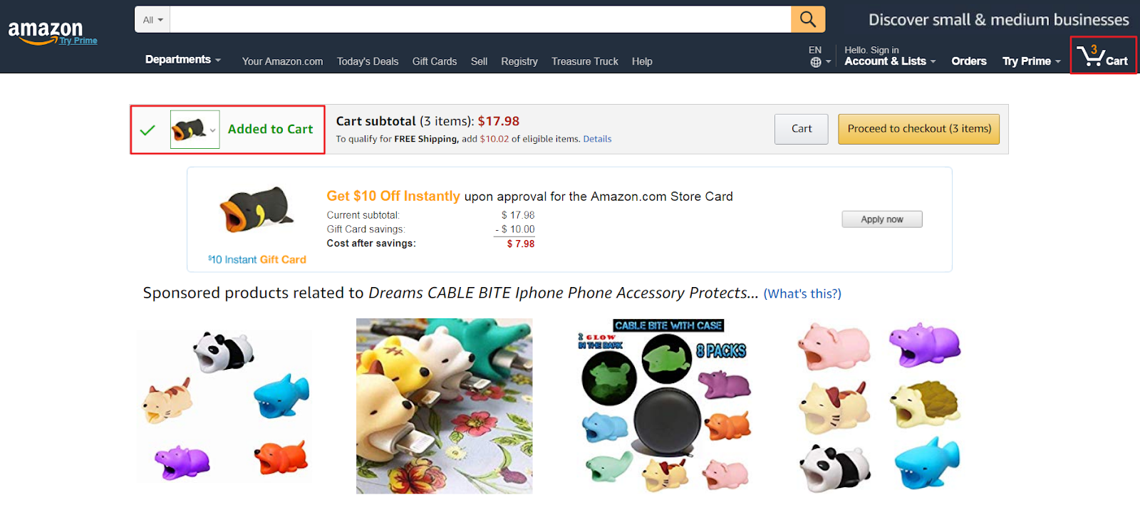
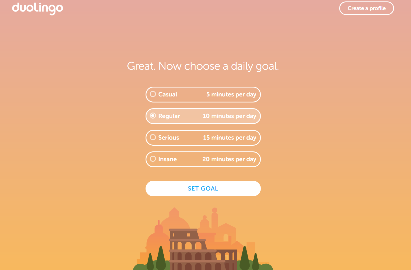
You can provide visual feedback by designing interactive elements to change based on the user’s interaction. It makes the user feel more in control and lets them know the system acknowledged their request.
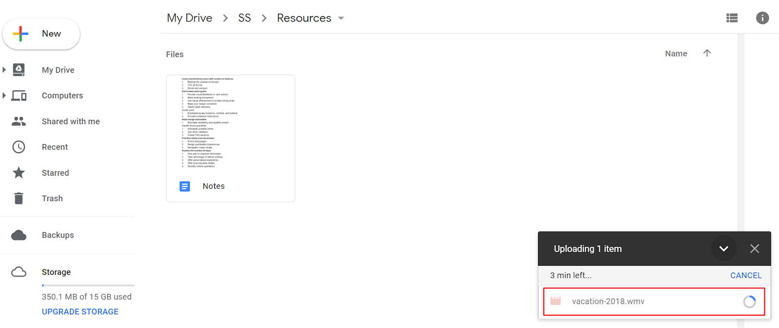
For instance, when you submit a form and a message pops up saying Thank you for getting in touch with us. We’ll get back to you shortly, you’re getting visual feedback from the website. You could also use progress bars to indicate how much longer the user has to wait.
Finally, clearly labeling interactive UI elements (such as navigation links and buttons) lets the user know exactly what will happen when they interact with it.
#2: Make designs accessible
Well-designed user interfaces make user flows smooth and frictionless for all users – including those with impaired vision or other disabilities. Improving your site’s accessibility reduces friction and enables you to create smooth user flows in your UI designs.
Here are some tips to help you comply with accessibility guidelines:
You probably already know that adding contrast to your designs can help you improve readability and eliminate legibility issues. But did you know that you can also use contrast to guide the user from one point to the next?
Using consistent UI elements across your site enables you to deliver a good user experience, make your website accessible, and create a frictionless user flow. Users will familiarize themselves with UI elements and their functionality, which is why it’s vital that you maintain consistency across the board.
Adding context-sensitive help – such as help links, instructions, tooltips and data formats – inline in your designs significantly reduces the chances of a user making a mistake. It’s a great way to help users achieve their goal without being too intrusive.
#3: Create an easy to understand UI
Intuitive, easy-to-use interfaces are synonymous with good user experiences. When a user interacts with a website for the first time, they put their existing knowledge to use. By making sure the user interface is in line with what they already know, you’ll be able to deliver a frictionless user flow that subtly nudges the user from one step to the next.
Here are some of the ways you can create intuitive user interfaces:
Microcopy loaded with jargon makes it difficult for the average user to accomplish their goals. While wording like use alphanumeric characters to create your password might be easy for a programmer to understand, the average user would respond better to something like use letters and numbers to create your password.
When it comes to designing smooth user flows, getting your site’s navigation right can be pretty tricky. We recommend mapping out your site’s navigation from the prototyping stage and conducting usability tests to gather data and further improve it.
#4: Shorten the number of steps
Every step a user takes on your site to accomplish their goal requires some effort on their part. Minimizing the number of steps in the user flow can help you reduce friction and make it easier (and faster) for the user to achieve their goal.
Here’s how you can optimize the number of steps users take on your website:
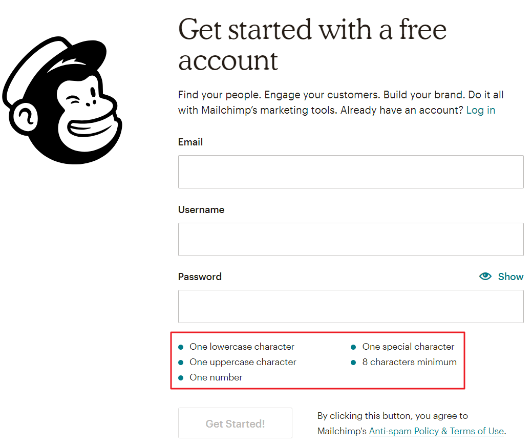
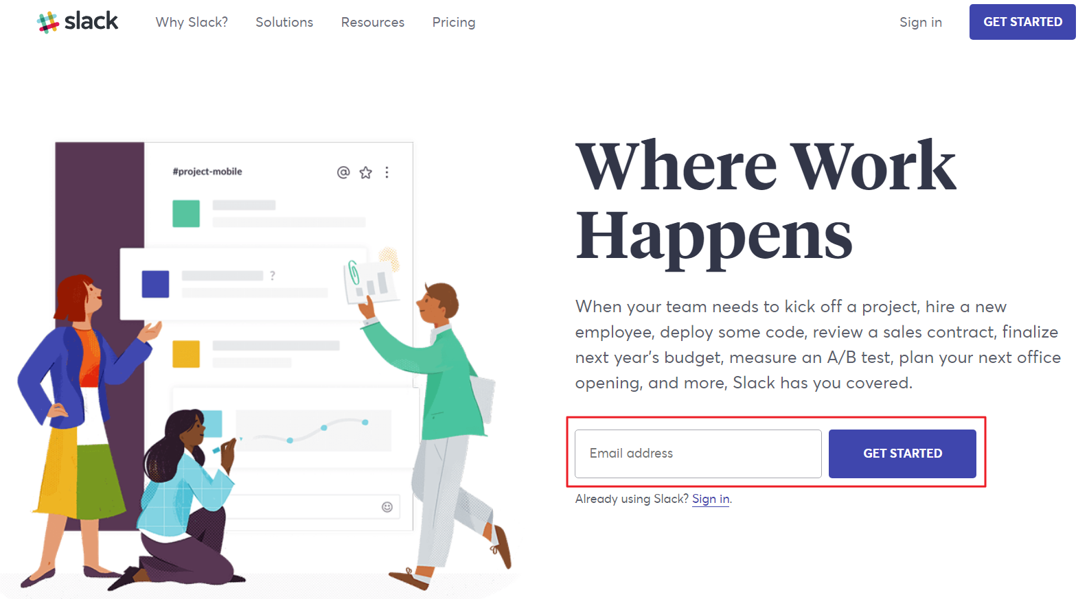
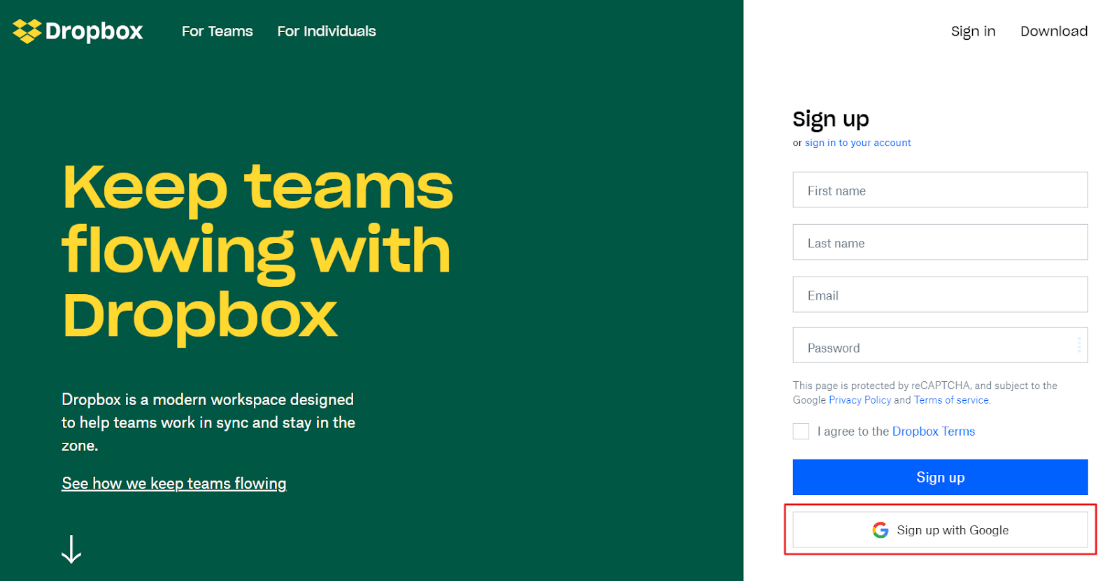
Ask users for information that’s strictly necessary, so you don’t overwhelm them with lengthy registration forms or a drawn-out on-boarding process. Think of it this way: the more information you ask, the more likely they are to drop out midway. Remember, you can always ask the user for more information once they’ve already signed up.
Consider auto-populating your users’ information into form fields wherever possible. For instance, if a user has already provided their complete street address, you can fill out the individual city, zip code, and country fields automatically.
#5: Keep users focused
Websites loaded with text, images, catchy UI elements, call to actions and whatnot not only clutter your user interface but also take away the user’s focus. Keep in mind that the user landed on your site with a specific goal in mind. As a designer, it’s your job to make sure they’re able to accomplish that goal as fast as possible.
Here are some easy ways to make sure users stay focused after they land on your website:
The first thing you can do is remove anything (UI elements, pop-ups, polls, ads, etc.) that’s unnecessary or distracting. By doing so, you can increase the chances of having the user achieve the goal they set out to accomplish.
Display information in digestible chunks wherever possible. For instance, if you have an unusually lengthy sign-up process or a long form that the user needs to fill out, you can:
- Group similar form fields together, e.g. billing information, contact information, etc.
- Divide the form into multiple screens.
Finally, you can limit the navigation options and the number of choices on specific pages to guide the user towards your conversion goal or main success scenario. Giving users too many options usually makes it difficult for them to come to a decision. Landing pages, for example, generally don’t display navigation options. Instead, the user has the option to click the call to action button or leave the website.
Conclusion
By creating frictionless interactions and designing smooth user flows, your product’s users will be able to achieve their goals quickly and with ease. Simply put: the less friction they experience, the happier they’ll be.
Down The Rabbit Hole