
 Article
8 Elements that make your design look out of date
Do you ever worry that you’ve incorporated so many trends into your website design that it looks like a certain time period? Or that the super-awesome website you launched three years ago is starting to look a little dated?
Don’t worry. It happens to the best of us…in fact, we’re breaking one of these ourselves.
But it is a good idea to take a look at your website annually and ask if it looks out of date in any way. Changing a few visual elements can refresh the design and keep your online presence fresh and modern.
Here are eight things that might be giving your website design a bit of a dated look and a few ideas for how to bring it back to life.
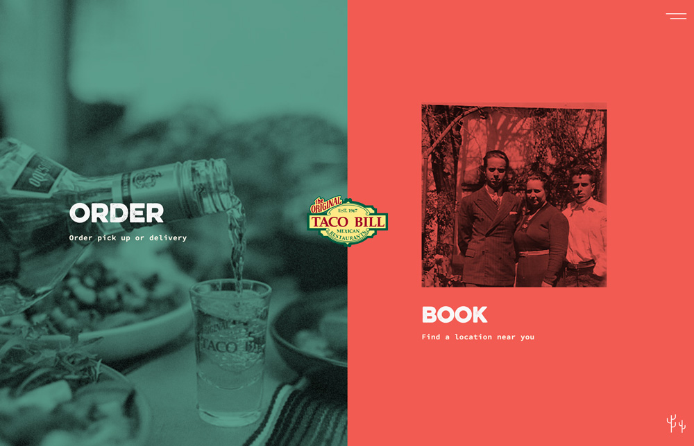
1. Homepage sliders
Homepage sliders – those big images that flip at the top of the screen – were the go-to solution for many designs for quite a while. Not anymore.
How many times have you actually sat and watched all those sliders go by? Moreover, how often have you actually clicked any of them?
While many websites were using sliders to get users to different parts of the design, most fell short and didn’t actually generate clicks. Further, sliders can actually frustrate users that miss something before it moves to another “screen.”

Do this instead: Opt for a single homepage image, background video or animation. If you want to send users to different parts of the website design at different times, switch the images/video and call to action as necessary. Giving users just one thing to do can increase engagement and keep visitors focused on why they are on the site in the first place.
2. Hide-everything hamburger menu
Hamburger menus that tuck navigation elements into a hidden corner remain popular. They tend to work well on small screens, such as mobile phones, but don’t serve a purpose on larger screens.
Desktop monitors have plenty of room for the design to include some obvious navigation. Navigation elements are important because they cue users into what your website design and content is about. Just seeing the words in a navigation menu can help keep users on your website longer.
Why would you hide this valuable information in a hamburger menu on large screens?
Do this instead: Reserve the hamburger menu for the smallest versions of the responsive design. Opt for three to seven strong navigation elements anchored in a key position on desktop website renders. Make sure to include popular links, such as About Us and Contact pages, in the main navigation. Consider a combination of a few navigation elements, plus a hamburger icon with additional navigation for desktop screens if you really want that icon in place.
3. Lack of mobile responsiveness
There are still websites out there that aren’t mobile responsive. (No kidding.)
Sadly, this is not generally a quick fix. If you still have one of these website frameworks that does not work on mobile phones, start planning a new website right away. Nothing is more important in 2018 than to have a website that works for every user on every device type with a fairly seamless experience.
Do this instead: Speed up your redesign plans. Find room in your budget now for a mobile-responsive website. Start thinking about the process by using a grid.
4. Too many ads
Websites packed with ads that pop-up, fill the sidebars and play automatically are so old-school. Too many ads can also slow down your website and prevent users from finding the information they are seeking. It can result in a lot of visual clutter and lack of organization.
But we understand that some of you have to have ads as support to keep your websites up and running. There’s nothing wrong with that. But you should focus on advertising positions with value, pursuing quality over quantity.
Do this instead: Opt for one of two prime ad positions – such as one anchored ad at the bottom of the screen and medium rectangle ad anchored in the sidebar position. That’s it. This ad concept will keep eyeballs on your content and your advertisers will actually get more response to their ads as well because they won’t be competing with so many other elements.
5. Multiple columns of text
Long-form content that is designed to replicate the look of a book page needs to go. Multiple side-by-side columns of text, a la newspaper style is difficult to read on screens. Further, standard text sizes for digital reading have slowly been increasing in size, making multiple columns even more challenging.
Consider breaking text into smaller chunks and short paragraphs to aid readability.
Think about websites that you like to read. How is the text designed? Do the text blocks on your website follow a similar pattern? If not, try to model copy blocks based on one of those websites you like to read.

Do this instead: First, figure out of your text is big enough. If you are still in a multi-column format, it’s likely that the text is too small. Consider bumping the default for body text up to 14 to 16 points, and then adjusting all other text sizes proportionately. (Your users will thank you.)
6. Pastel and muted color palettes
There was a time when it seemed like every website design had a beige or light colored background with colored elements and black text. That boring outline is no longer the norm.
Bold, bright color choices and even color palettes with a wider range of color are a more modern, popular option. Use your brand colors and alternates to create a website design that’s highly engaging and has plenty of visual interest.
And while muted, pastel palettes are out, high contrast options remain popular. So make sure to pair light and dark background and text pairs to ensure that everything is easy to read and understand.
Do this instead: Not sure what to do with color? Try a black and white design with a few colored accents. Some creative directors and brands aren’t a huge fan of rainbow-style and bright color palettes, so a more modern black and white, or dark with light text option can be more of a fit.
7. No distinct calls to action
A homepage with no call to action is a waste of a website. Website designs without some way to capture users’ attention and give them something to do is a loss.
Users have almost come to expect giving up some type of information in exchange for something, such as an email address for a coupon code, so create a call to action that is easy for users to see and engage with and easily accessible.
But don’t go overboard with CTAs: One ask per “screen,” or content type or block. Don’t overwhelm users with so many calls-to-action that they aren’t sure how to interact with the design.
Do this instead: Create a simple CTA that can be used across multiple pages to reinforce the idea of performing a specific action for users. An easy form – such as email address paired with a submit button – is a quite effective way to do this.
8. Anonymous contact forms
Users hate anonymity on the web. Contact forms that don’t come with email addresses, phone numbers or physical addresses can be real turn offs to users. Having actual contact information in addition to a form confirms your credibility to the user.
It also gives the user a method of follow-up if there is no response to a form submission.
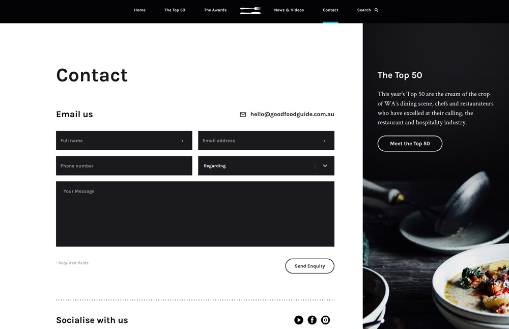
Do this instead: Always include actual contact information in addition to online forms. Tell users when to expect a response from you. The more your website shows that there are real people behind it, the more trust you will establish with users.
Conclusion
What are you waiting for? If your website has any of the issues we’ve detailed, schedule a brainstorming session right away and start planning how you’ll eliminate these mistakes that totally date the design.
Just a few simple tweaks can have your design feeling fresh and modern in no time. It might even boost user engagement as well. Good luck!
Down The Rabbit Hole