

 Article
Efficient UX starts with the Gestalt Theory
Good design often starts with a good eye for space, typography and relationships between design elements. But there’s distinct design theory that backs up that thinking – Gestalt Theory.
Simply, this concept pertains to visual perception, how elements are actually seen by users and what this means in terms of the overall design. The concept dates to the 1920s and is rooted in a German word meaning “shape or form.” The idea that the “whole is the sum of the parts” comes from the principles of Gestalt.
The Interaction Design Foundation describes Gestalt Theory like this: “Gestalt principles describe how the human eye perceives visual elements — in particular, they tell us that complex images tend to be reduced to simpler shapes.
“In UX design and interaction design, Gestalt principles play a large role in making interfaces usable and easy to understand. Designers can use the Gestalt principle of proximity —where elements that are arranged together can form a more complex image — to group conceptually similar elements together in a website. An example would be grouping an image, a title, and an excerpt together in an ‘article card’ design.”
Proximity

Proximity explains the idea that when elements are placed together, the user sees them as a singular item or group.
Elements in proximity to each other can be of the same or different type or shape. This method of grouping helps establish like elements and organization. Often visual flow and overall design hierarchy are linked to proximity.
Groups of elements can be large or small; some of the smallest elements include navigation bars or a row of cards or buttons, such as in the example above. Note how each of the small cards contact an icon and text. They are linked because of how close together the elements are in relationship to other elements in the design.
The proximity principle is the reason your eye automatically groups elements within each card in the design.
Similarity

When items have a similar look or design, the user will see these elements as a group or pattern in the design. There are plenty of visual characteristics that can contribute to a design that includes similarity.
- Color: The design uses specific colors for elements or interactions, such as using red for buttons or calls to action.
- Size: Design elements are identifiable and ranked based on how large or small they are in relationship to other elements. One of the most common examples of size similarity is with typography. Headlines and body text are dramatically different sizes in most designs, but are consistent from page to page.
- Shape: Elements of the same shape are expected to do the same thing. Think about clickable elements in a design for a moment; buttons are often the same shape to cue users that every button, regardless of location, does the same thing.
Note the grouping of the four panels in the design above. While they all feature different images, they are similar because they use the same treatments for headlines (size) and shape or each clickable element.
Continuance
One of the things that makes a design effective is visual flow. Continuance describes the action that occurs when the user is compelled to look from one element in the design to the next.
Directional cues and size cues can help dictate this motion, which is vital to keeping users engaged.
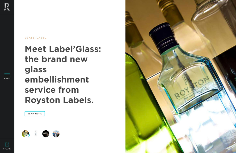
Royston Labels, above, uses continuance exceptionally well. Note how the first element you probably look at is the image on the right side of the screen. But it almost points you to the text on the left thanks to a directional pull. That’s the idea of continuance in action.
The same concept can be deployed using size. Most users will almost always look at the largest element on the screen – whether it is an image or text – then move to smaller elements. Consider how that first look will influence what users interact with next.
Closure

Closure deals a lot with negative space and whether an element creates a closed visual element or not.
Closure works because when elements are left open or incomplete, the human brain tries to fill in missing information and make sense of it. Closure is often used with logos or icons and is a great tool to help simplify elements and prevent the design from getting too cluttered.
The World Wildlife Fund logo, above, is a classic example of the Gestalt principle of closure. With just black shapes, the logo forms the embodiment of a panda; take note of the open space in the design and how you just know what the shapes create together.
The one caution in working with closure is that shapes need to be clearly discernible to be effective. Closure works because users can identify elements quickly. If they have to go deep into thought to figure it out, that design element probably needs to be re-envisioned.
Figure and ground

While figure and ground is a little harder for people to understand, it’s not that complicated. Figure and ground is the idea that users can differentiate between the background and foreground. Users should be able to clearly see what the main object is in the design and what part of the design is simply the background.
The figure is the main part of the design, or object that users are supposed to see primarily and focus on. The ground is the background or secondary design element.
The design above has multiple levels of figure and ground. At first glance the figure is the woman wearing sunglasses and the ground is the lavender backdrop. After reading the text, a new figure emerges – the sunglasses, which is the product this website is selling. The ground becomes the woman wearing them, as well as the lavender color.
Symmetry
When designs are built using symmetry, the user expects the two sides to go together. Symmetry can often overrule other principles because the human eye is quite sensitive to symmetry.
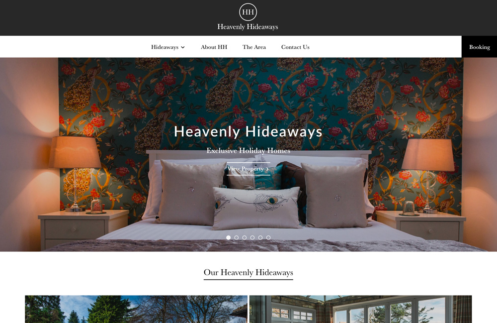
Symmetrical elements are commonly simple, create visual harmony and are easy to understand. But they can also offer levels of visual complexity, such as the example above from Heavenly Hideaways.
The hero image, as well as elements below and above, create perfect symmetry whether you look at each element in isolation or as a whole. Take note of the HH logo, which can be split vertically or horizontally, with each piece looking exactly the same. Further, you can segment the entire design and it will look the same. While there are a few subtle differences so that the photo is not a perfect mirror, it is close.
Conclusion
It’s important to understand Gestalt Theory when you tackle a design project because even if you don’t plan for it, users will see elements and groupings based on these principles.
From the very first brainstorming sessions and planning content to the beginning of the creative direction, you should thinking about how Gestalt might impact the design or change your ideas about how elements should be grouped or placed in the design.
Down The Rabbit Hole

